_LOGO_IDENTITY
Western Province Kodokan Judo
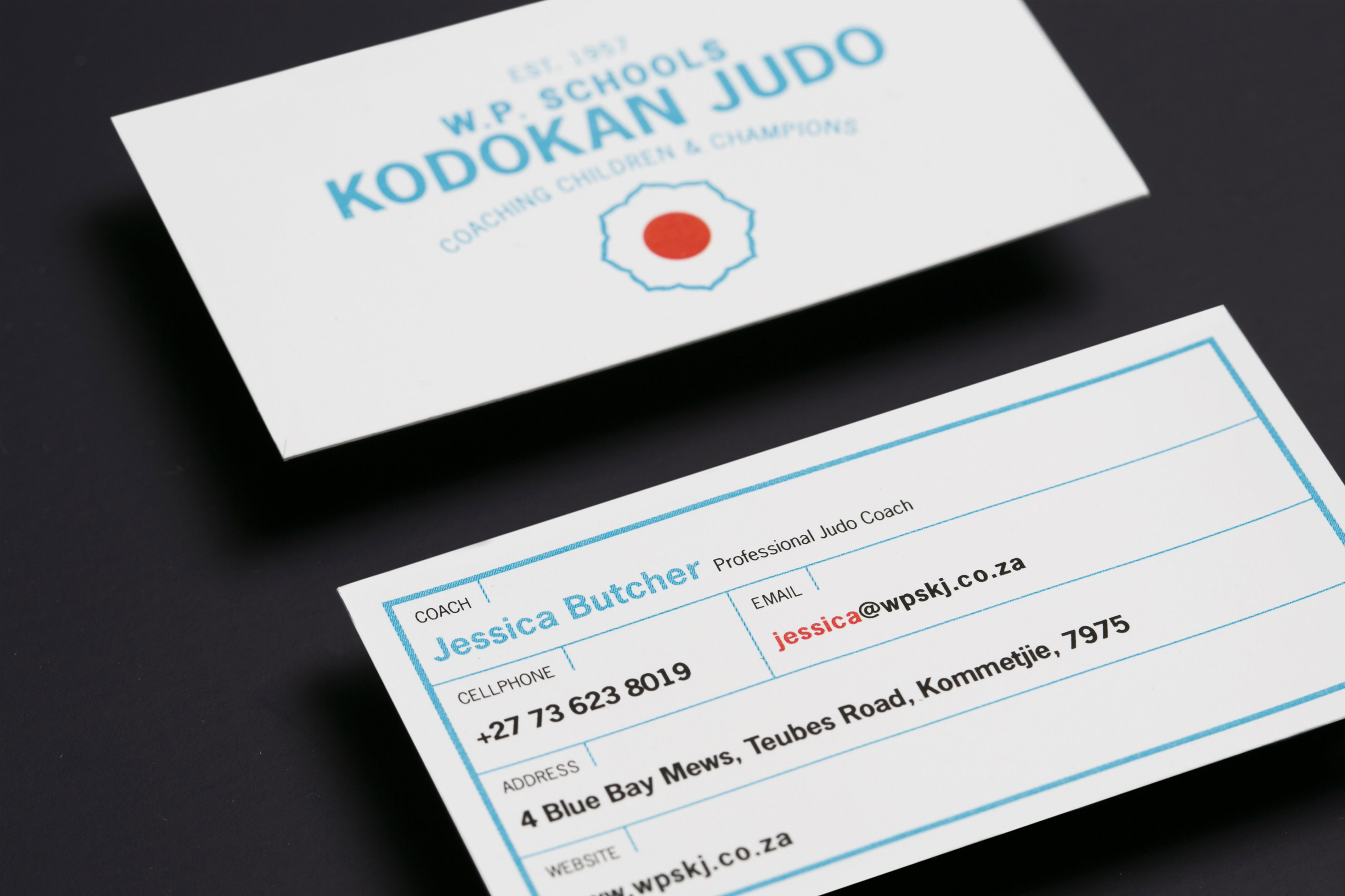
How I brought a slick edge to a Judo development school.
Western Province Kodokan Judo is a leader in Judo development. WPKJ uses Judo as a foundation for childhood physical and mental well-being, building confidence, self-esteem, and respect.
Photography
@russsmithphotography
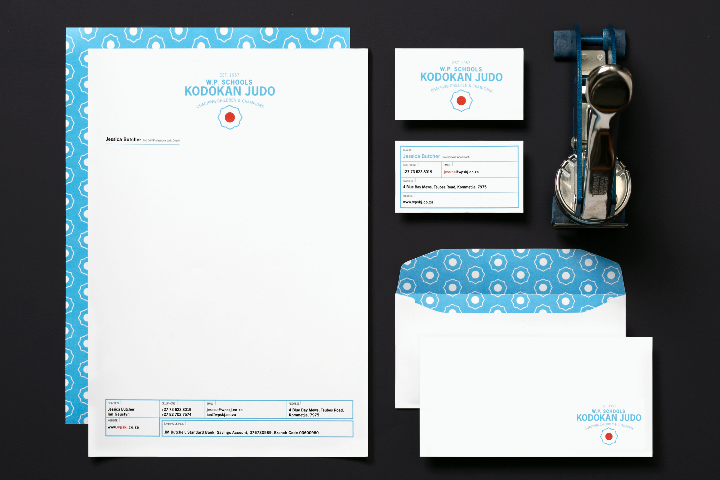
A slick look can often revitalise a brand and bring in a host of new clientele. My modern and structured rebrand resulted in the Western Province Schools, Kodokan Judo becoming the largest Judo monopoly in the Western Cape in a matter of months.
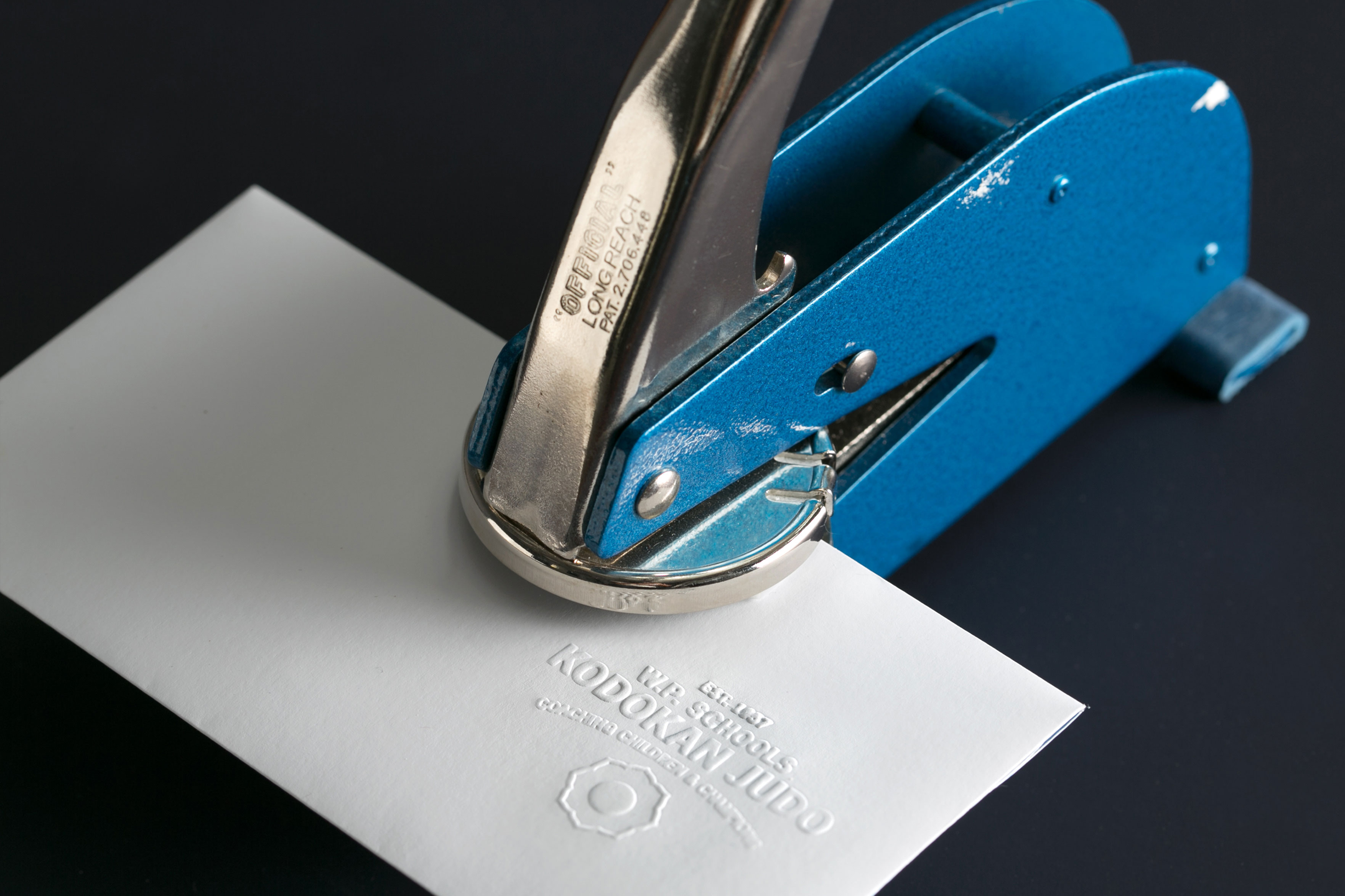
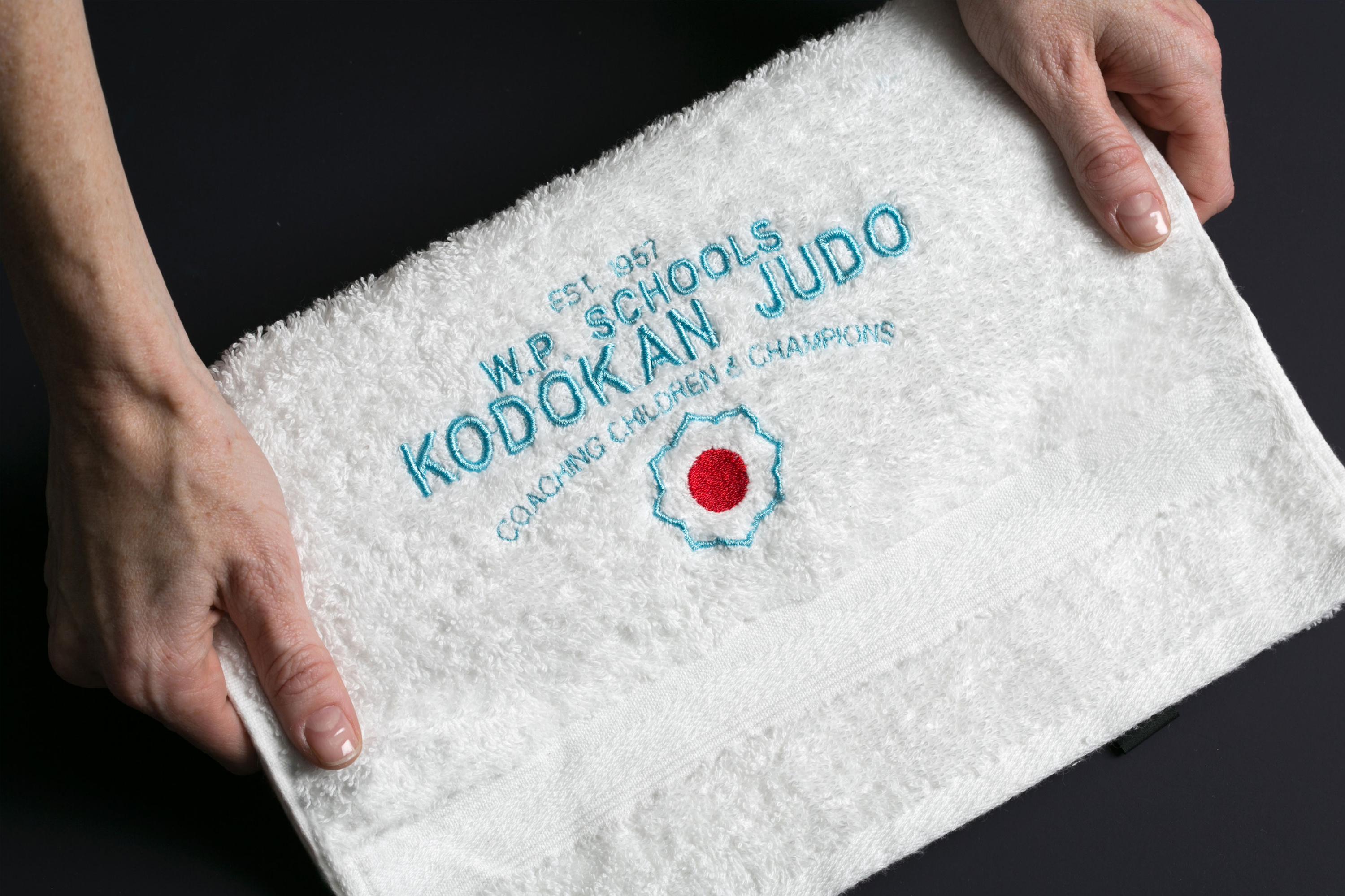
The bold iconography and symbolic colours, reminiscent of Judo’s Japanese heritage, are combined with strong typography in a classic, contemporary manner. These elements visually establish the brand as a trusted forward-thinking company that values its roots. The identity elements – patterns, icons, typography, and iconography, effortlessly transitions across multiple stationery items which cement the brand.