_PACKAGING
Vida e Caffè
How I brought new life into Vida E
Established in 2001, Vida e Café is the South African coffee brand of choice. The brand draws inspiration from Portugal and Africa, which when blended together becomes a place that inspires the soul.
Photography
@photography
Styling
@styling
Printer
@printer
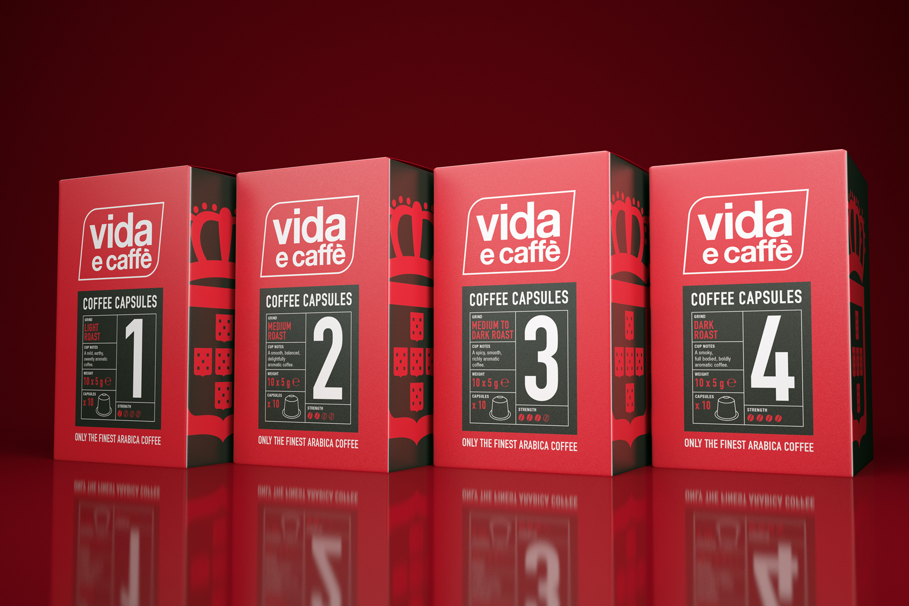
Supermarket shelves are overflowing with brands vying for consumers' attention. Vida e recognised that they needed a bold new design to stand out amongst the competition.
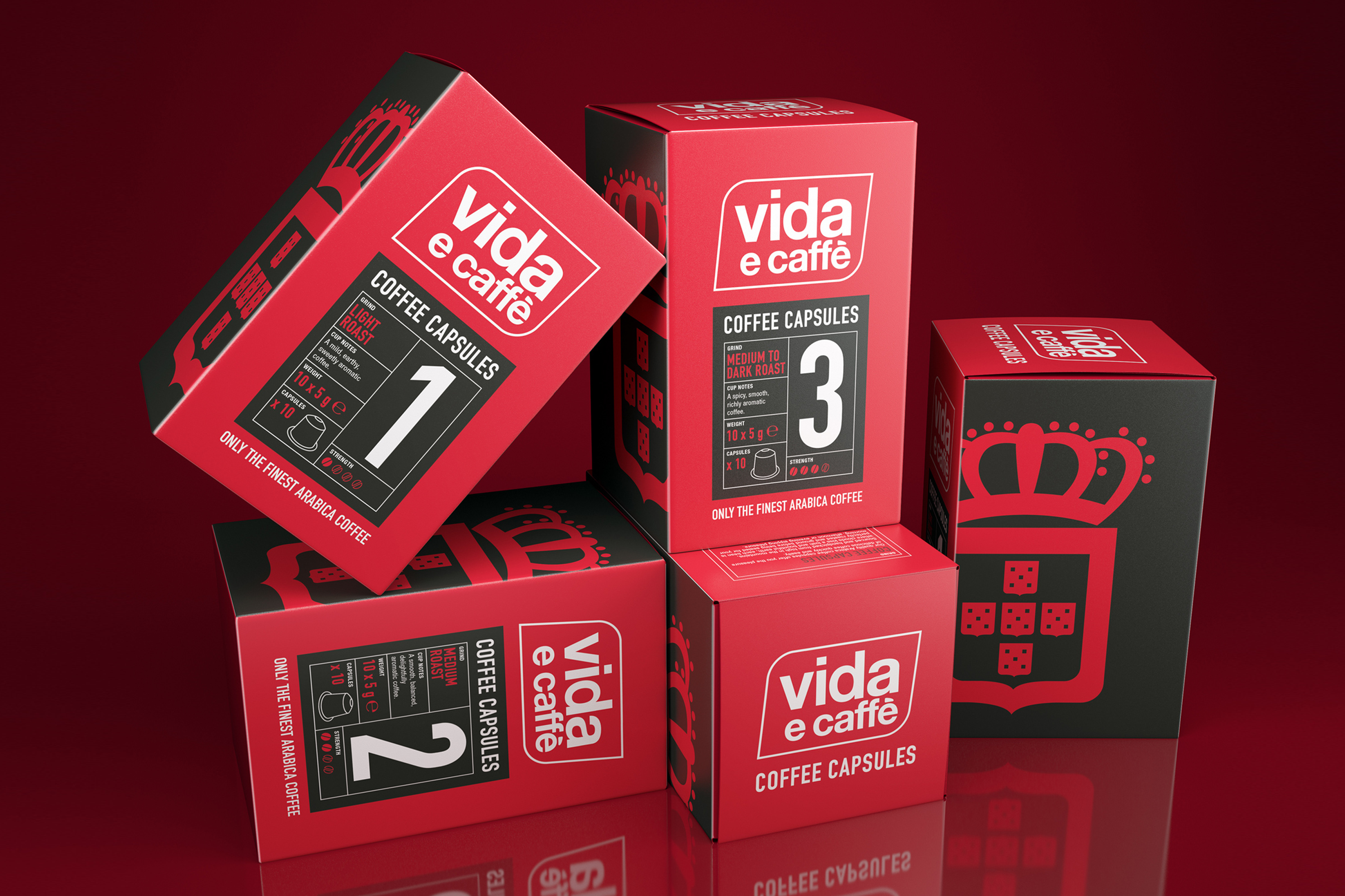
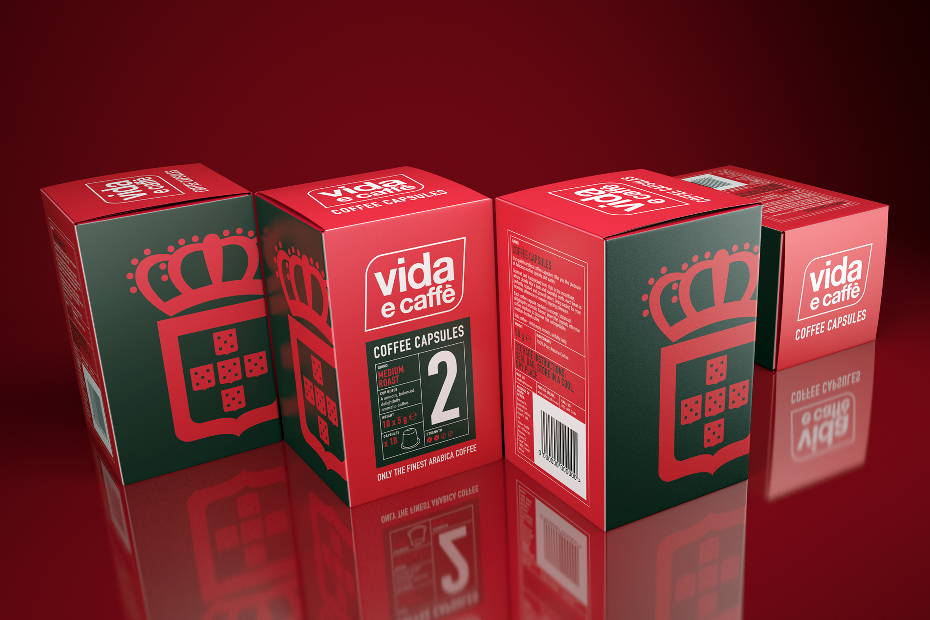
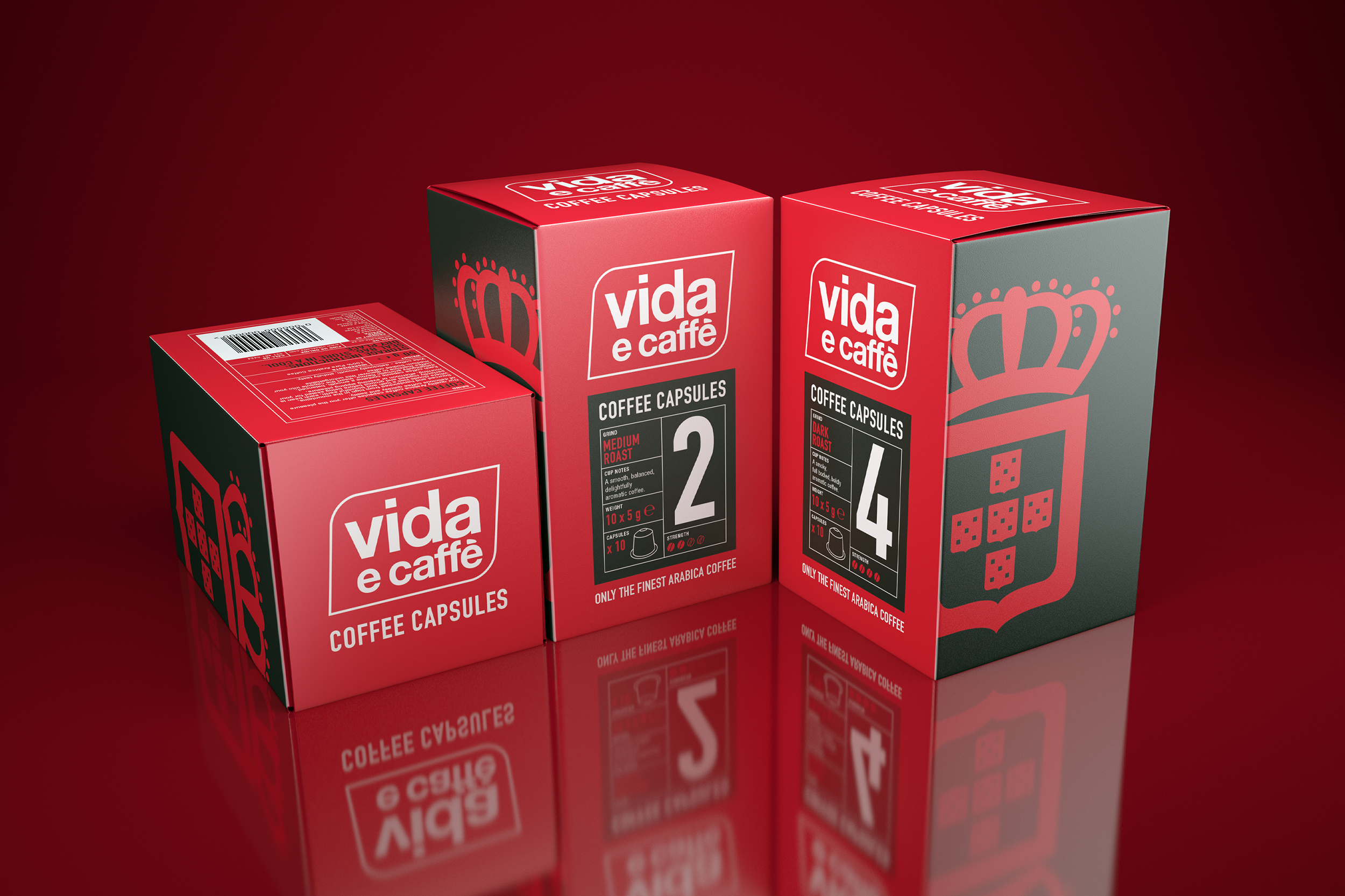
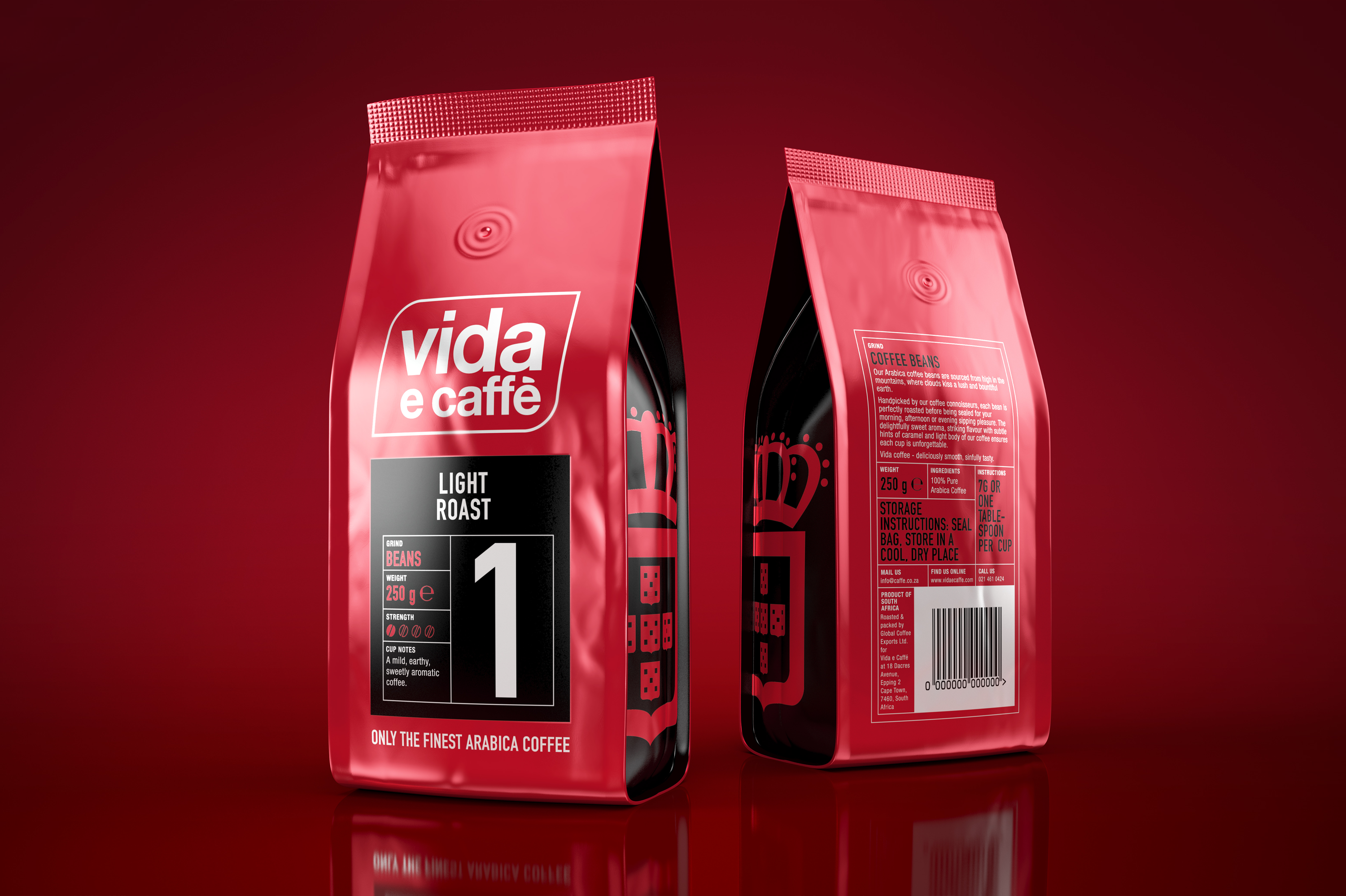
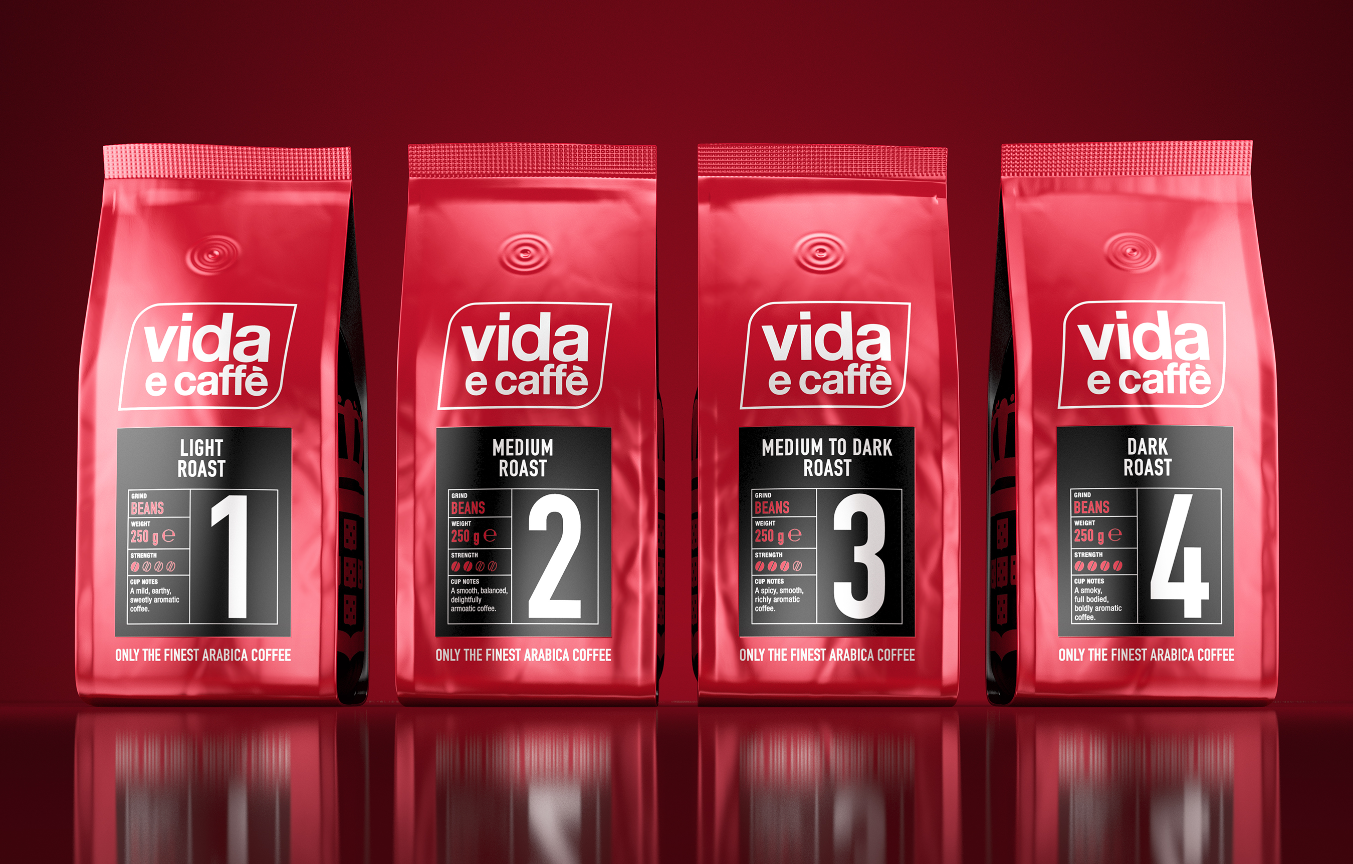
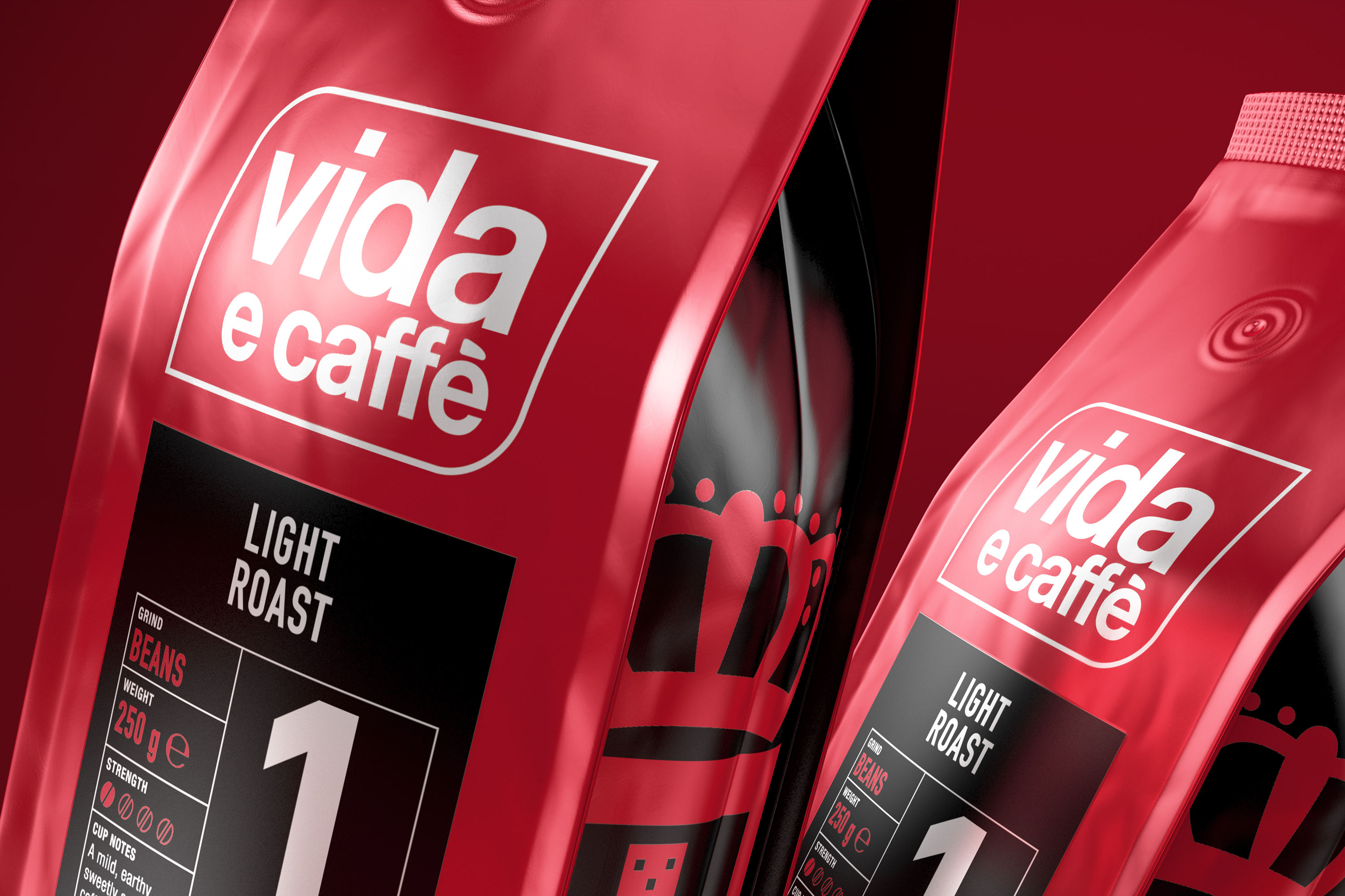
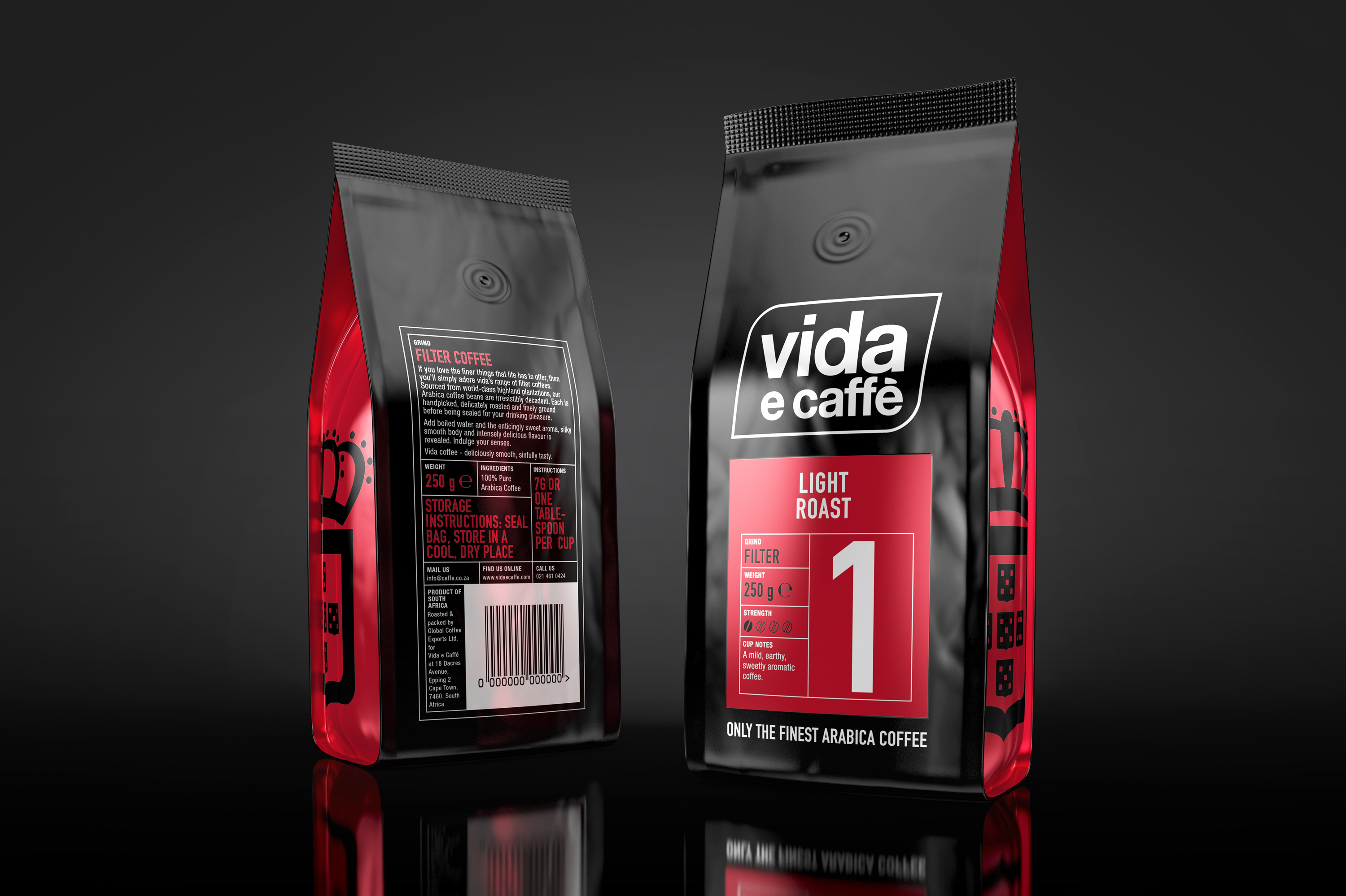
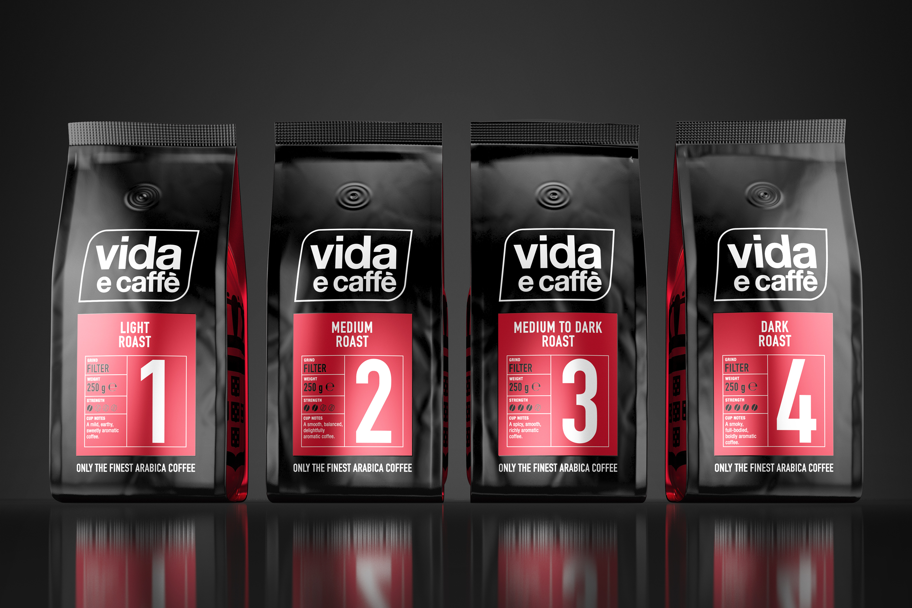
I wanted to create packaging that is simplistic but striking. The branding is clearly visible and the structured graphics add depth. Importantly the copy can be read with ease which allows consumers to navigate the blend and strength of coffee at a glance.
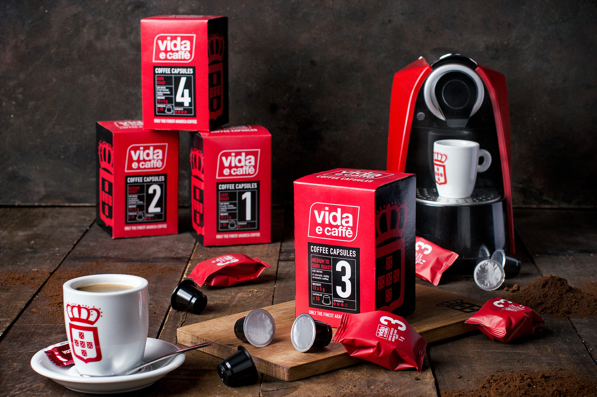
The packaging design for the capsule boxes is simplistic yet striking. The brand is clearly visible and supported by the colour choice and graphic symbols. Large numbers instantly show the strength of coffee and they make a statement on shelves.
