_PACKAGING_ILLUSTRATION
Skin Creamery
How I showed that simple is often better when it comes to design.
In a world flooded with information and choice, Skin Creamery exists to simplify skin care.
Rendering
@MF3D
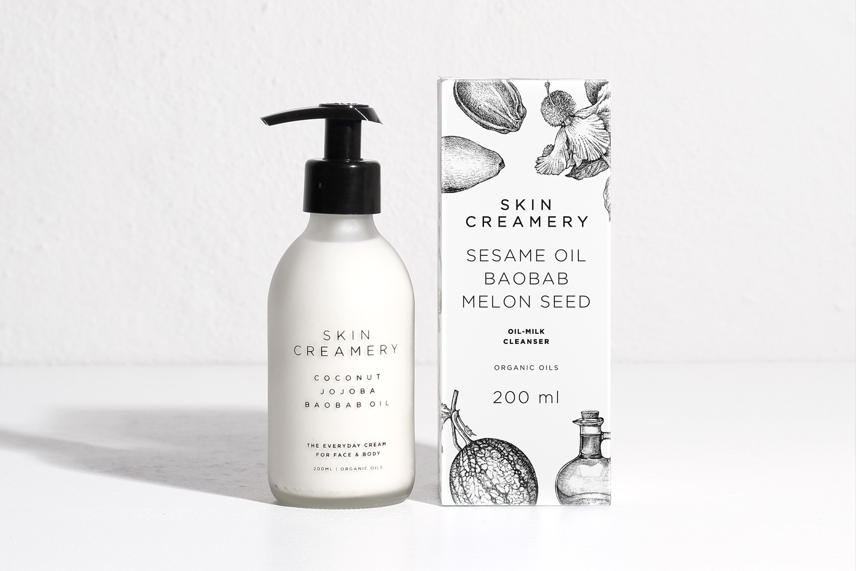
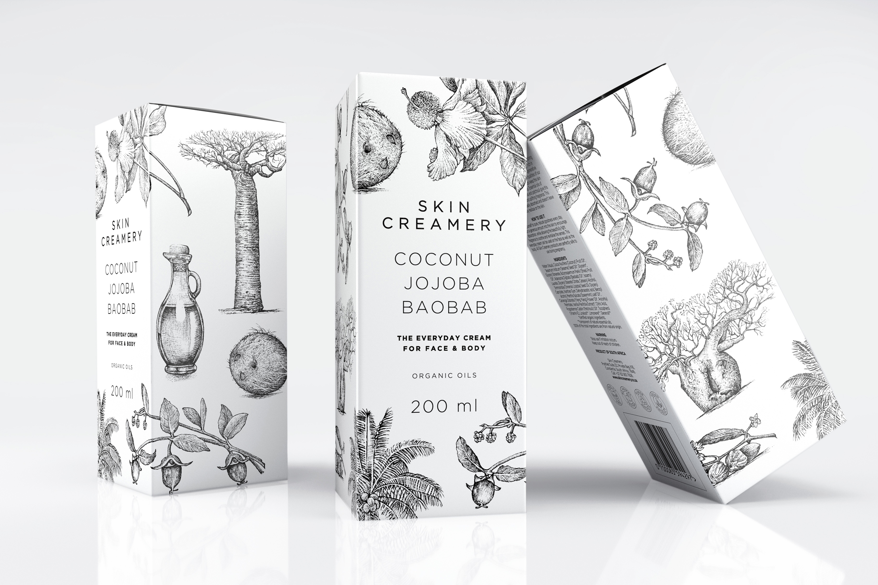
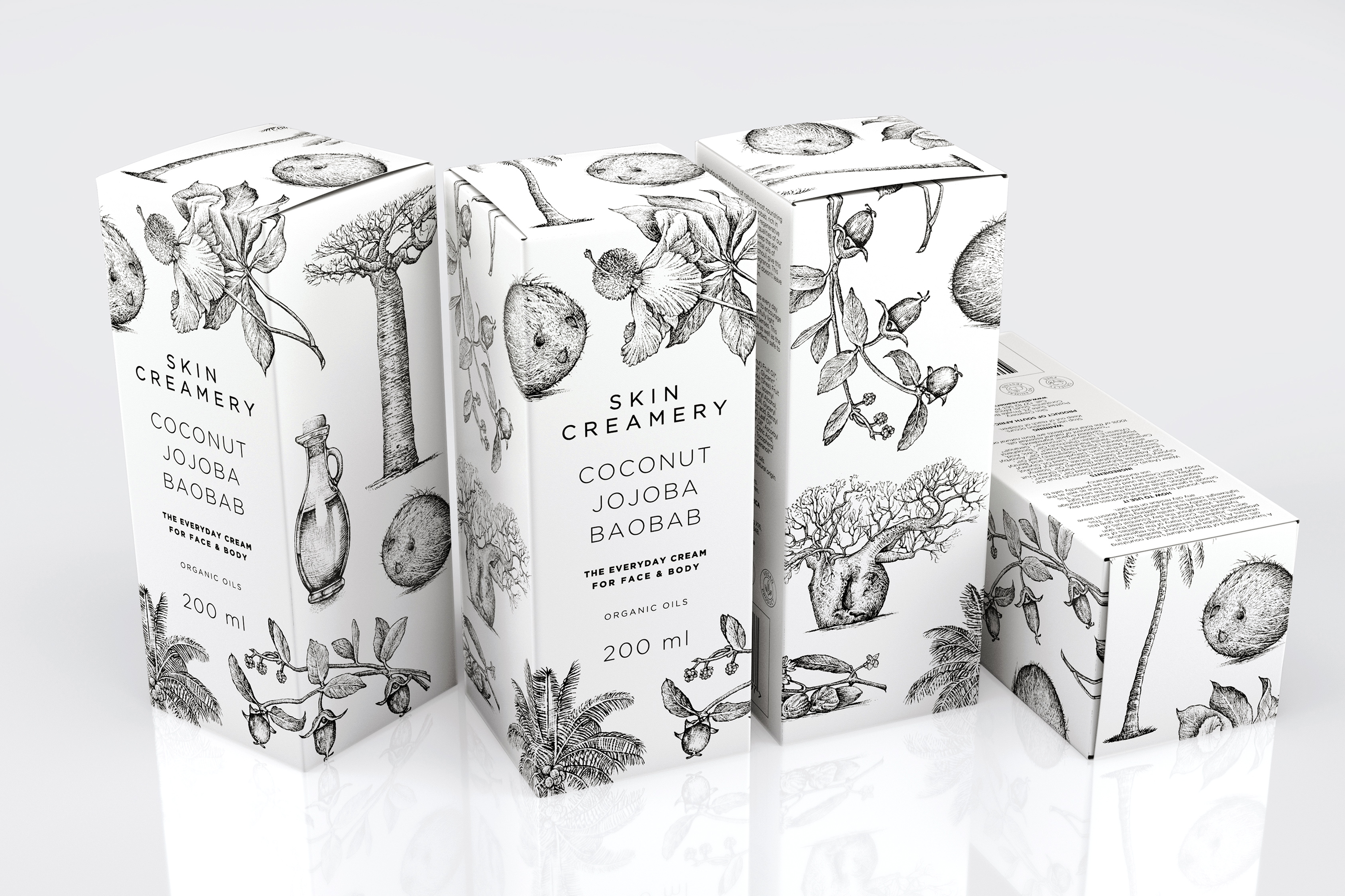
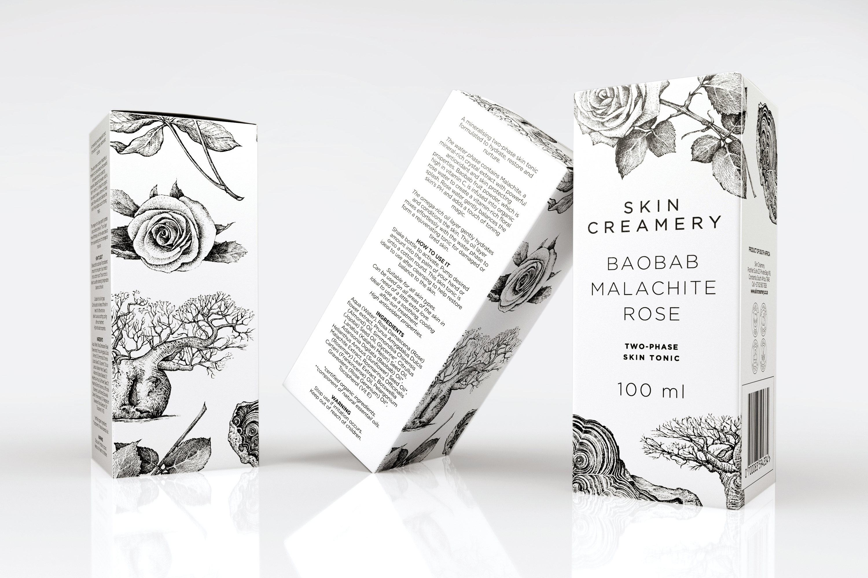
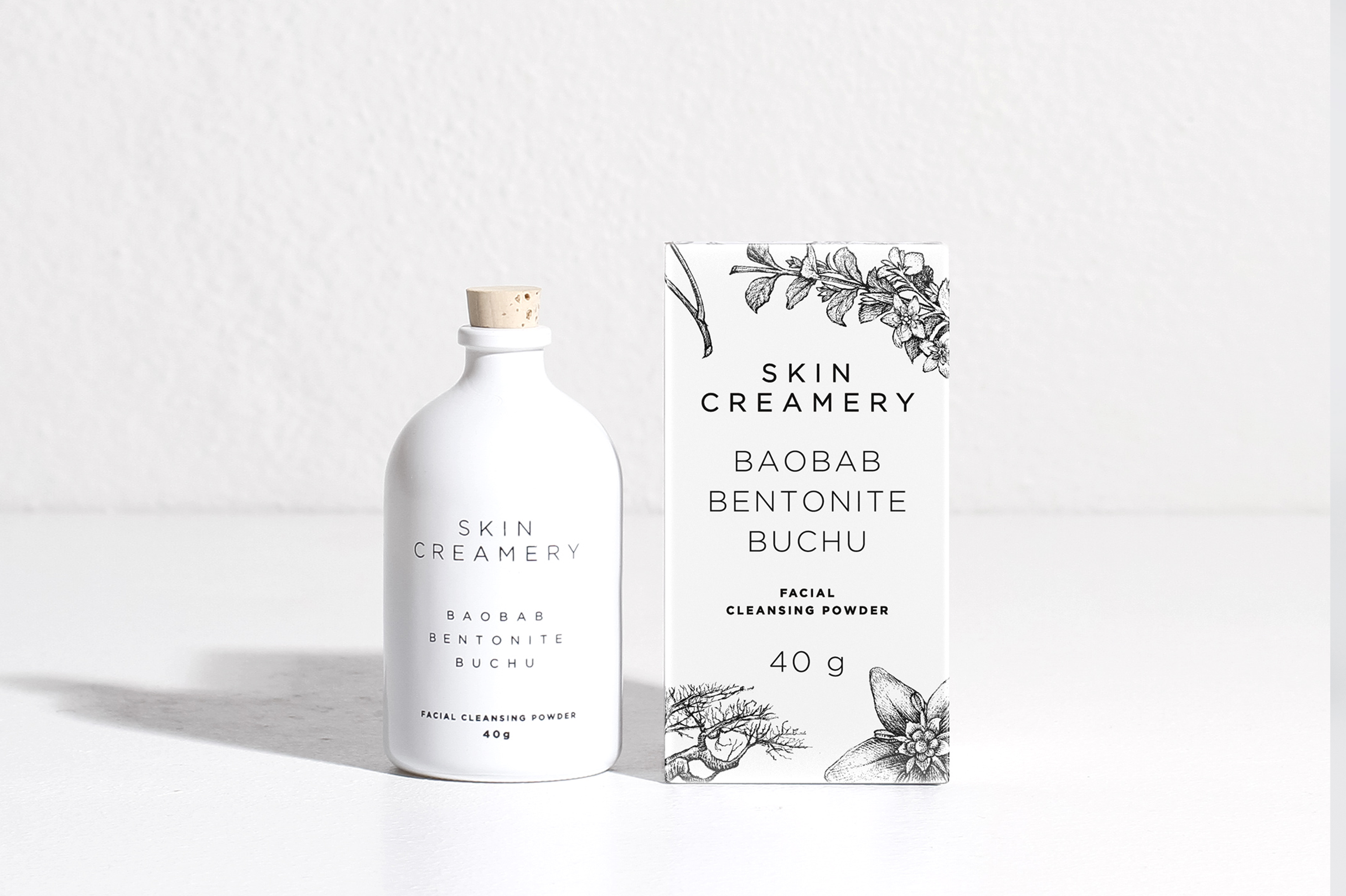
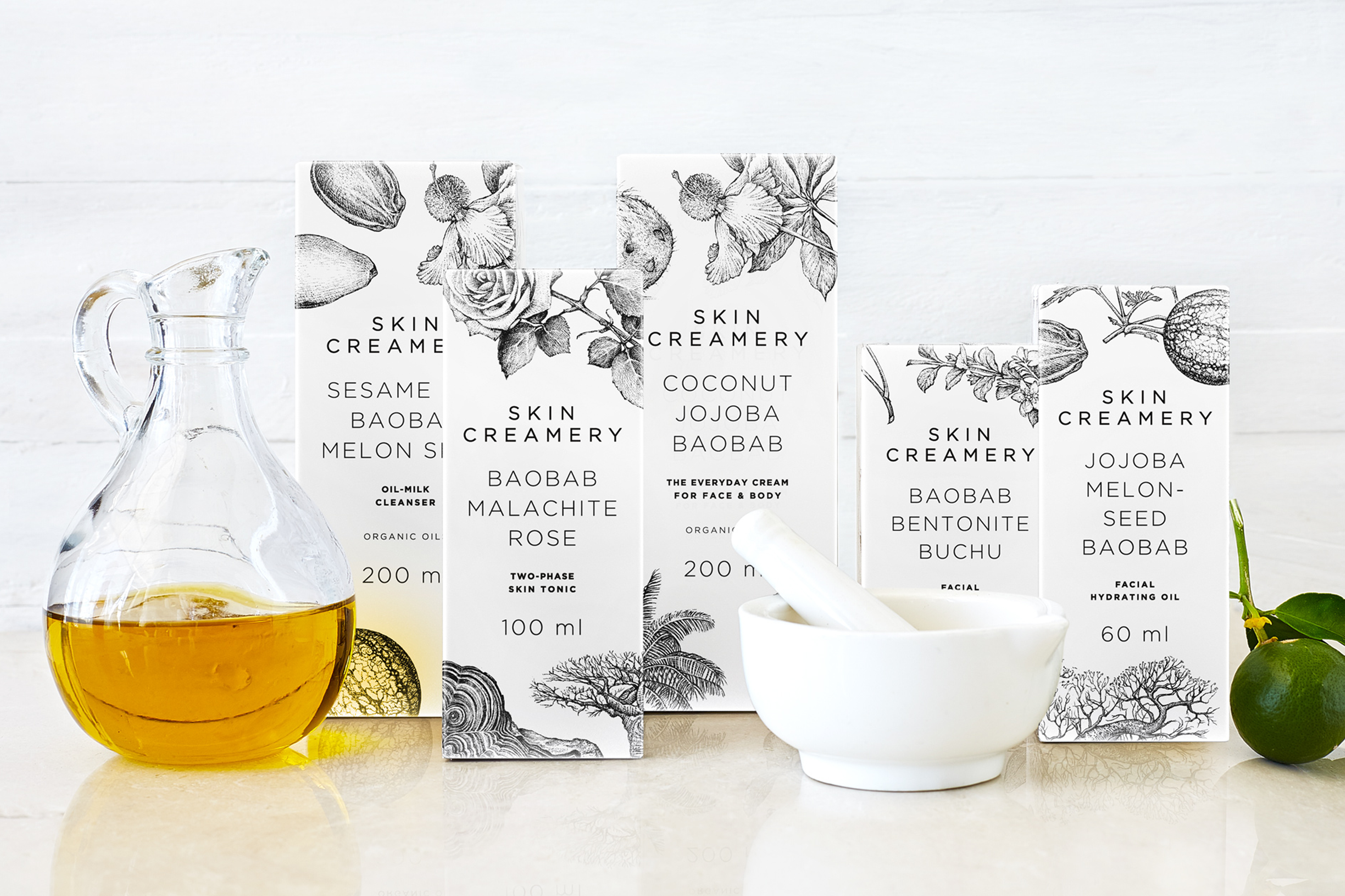
As a health and organically-conscious brand making headway in European markets, the packaging design needed to embody the product's essence.
I created etchings of the ingredients used in the products and arranged them sparingly on clear white packaging. The etchings are a nod to the origins of alchemy and skin care and this design element sets the packaging apart from the modern, clinical, minimalistic approach of competitors. The etchings, combined with elegant typography, deliver a classy and eco-friendly design with a lot of heart.
