_PACKAGING_STRATEGY_IDENTITY
Pharmacy at Spar Condoms
How I shocked my family, and other design overhaul stories.
Pharmacy at SPAR is a group of over 104 independently owned and run pharmacies within the SPAR Guild Group of South Africa.
Rendering
@MF3D
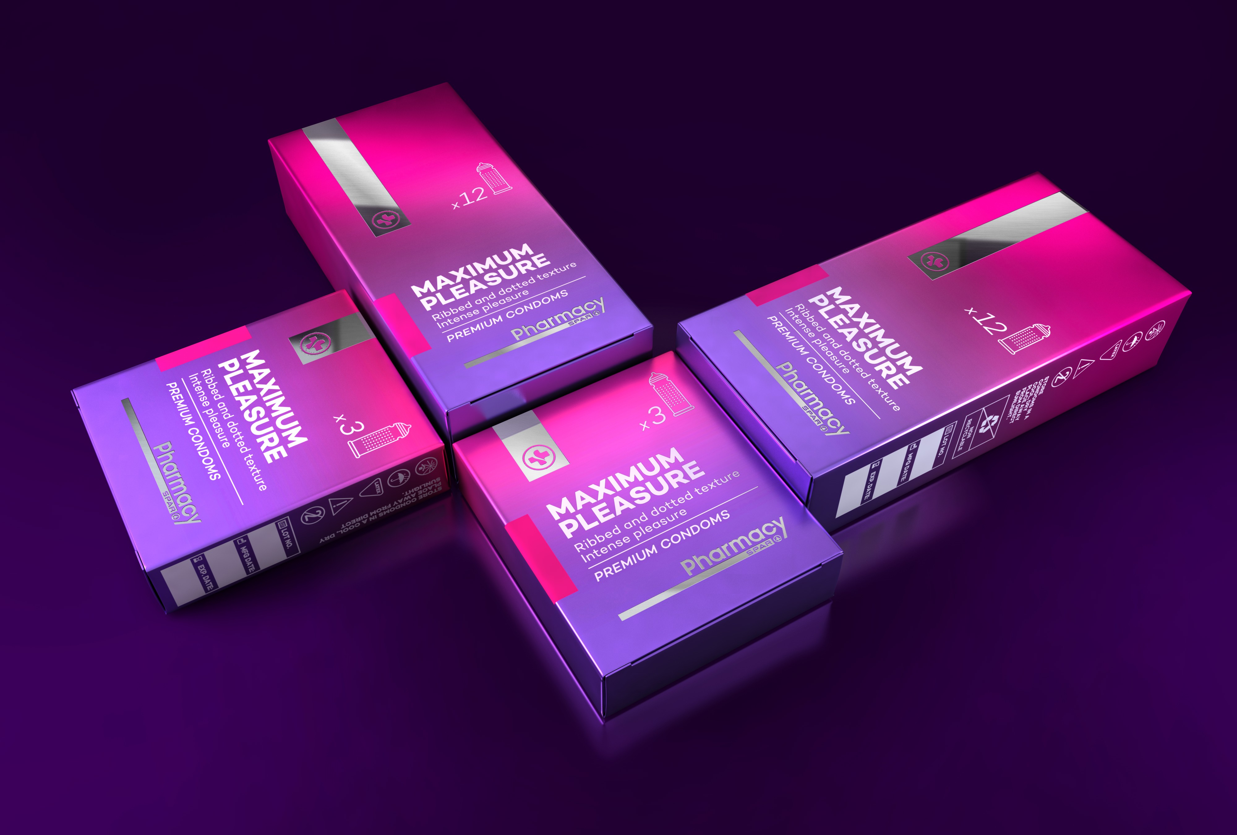
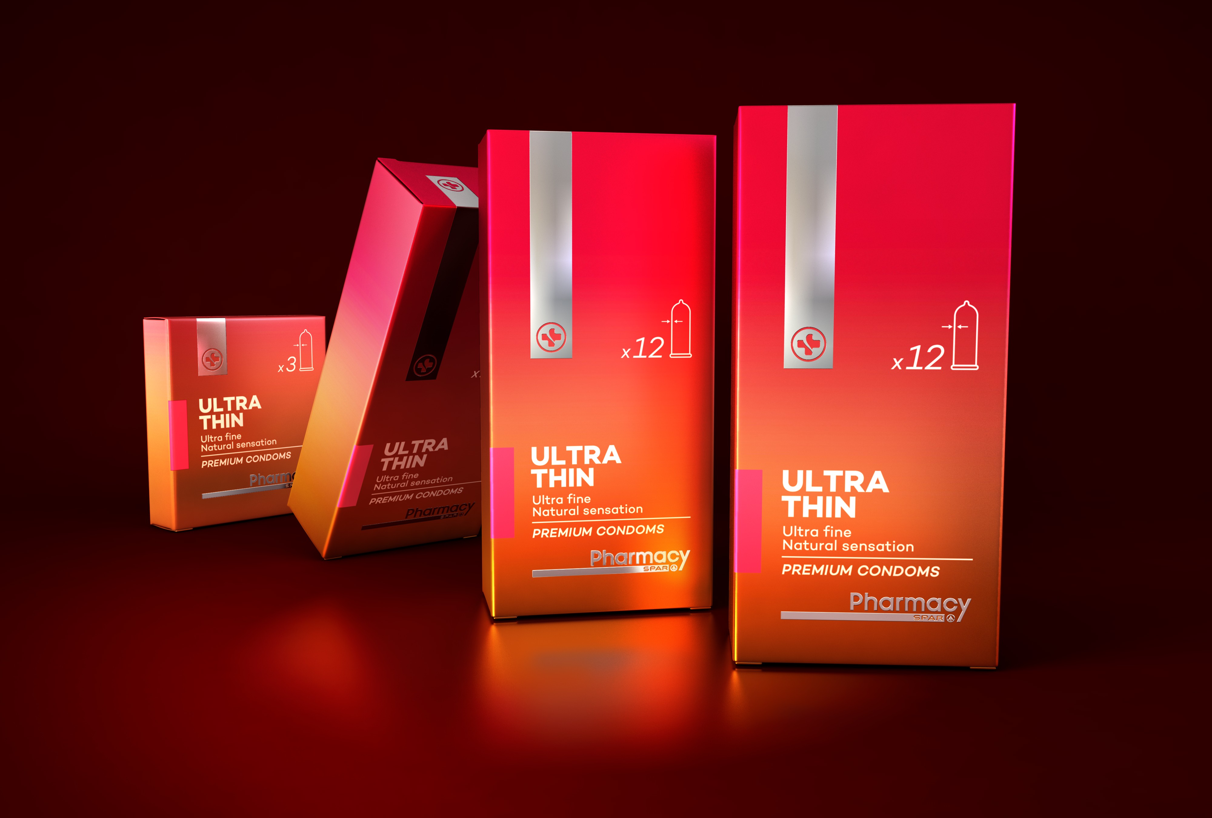
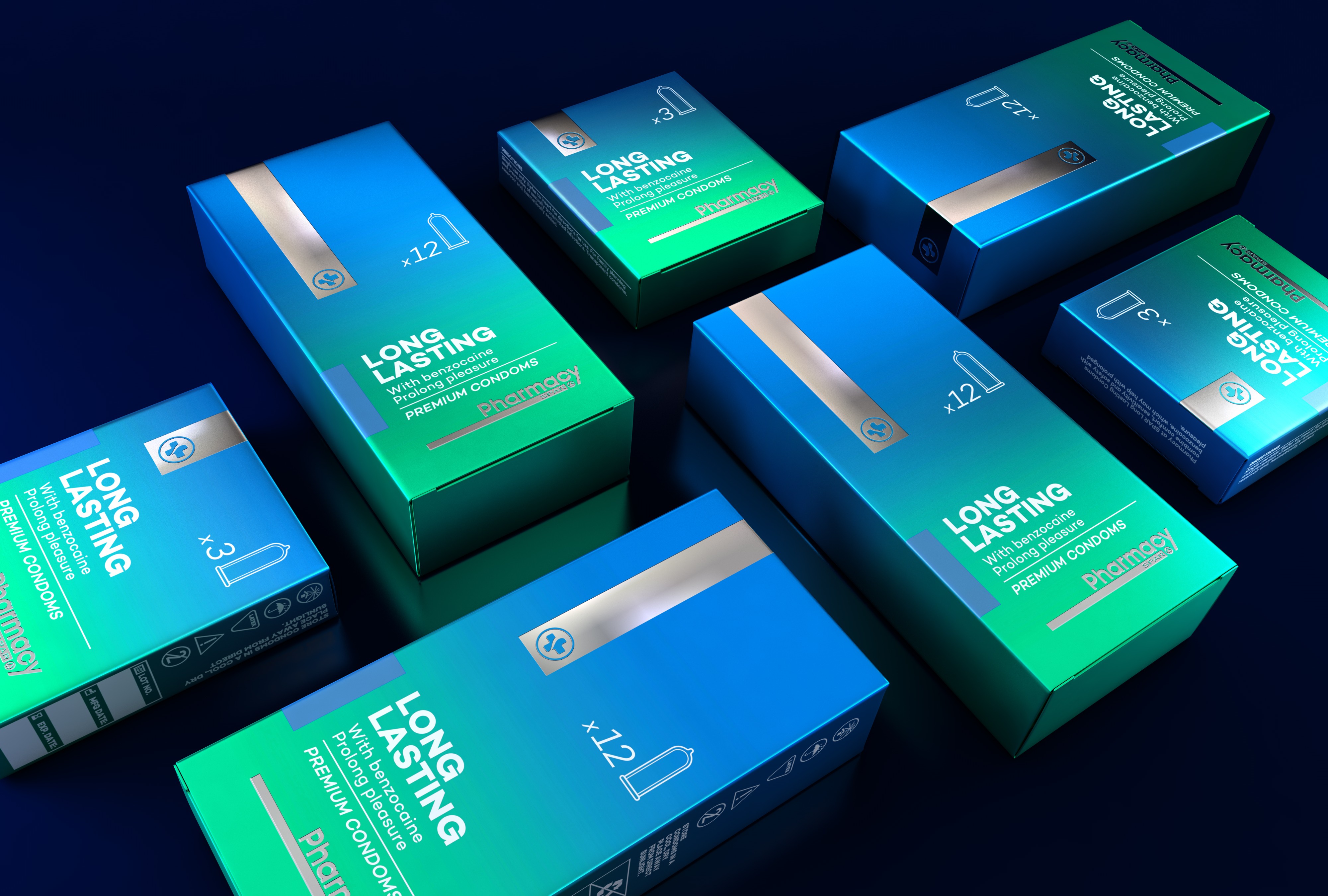
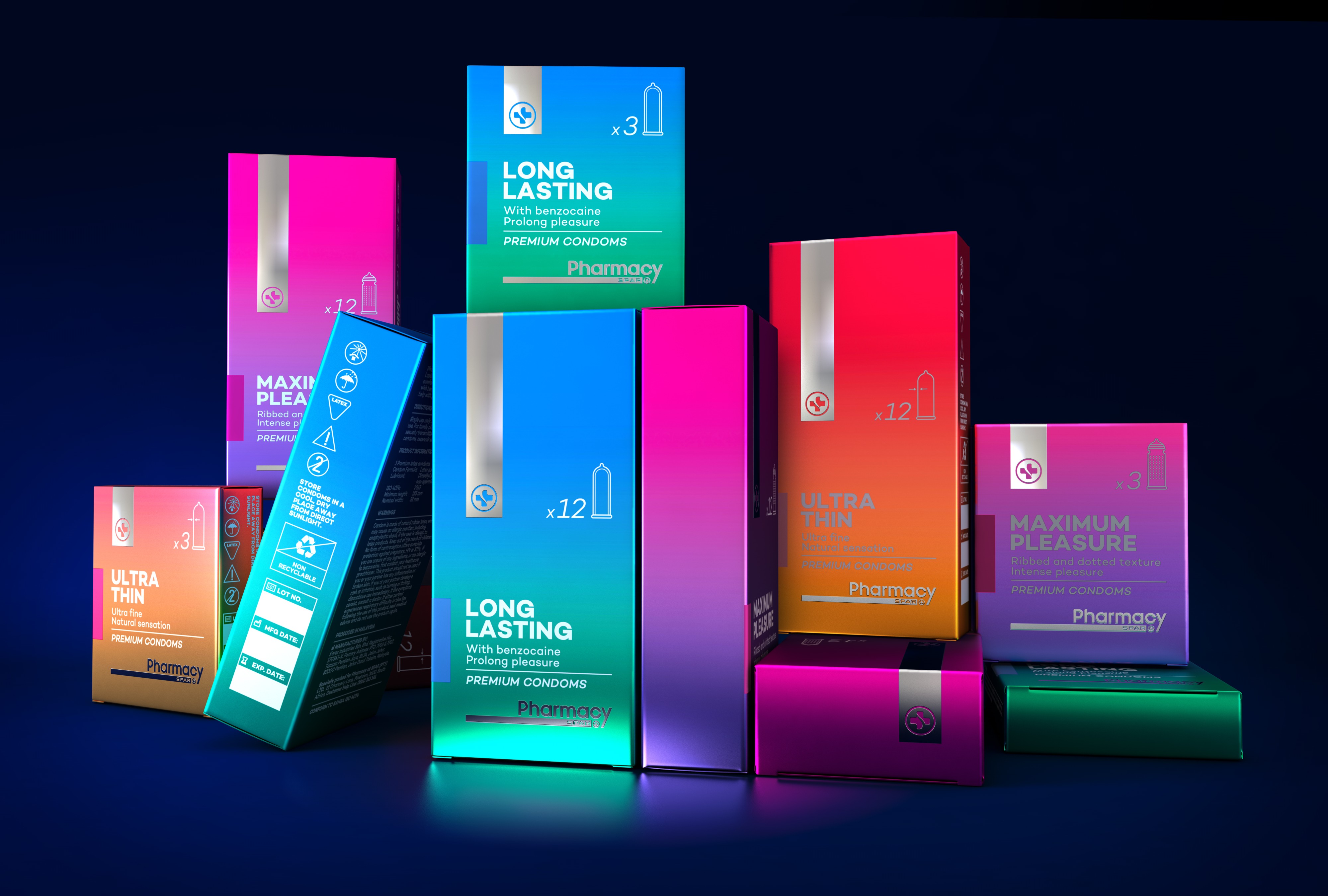
More often than not “own brand” packaging design is dull, unimaginative, and it usually looks cheap. This leading pharmaceutical brand recognised the need for a makeover and I was chomping at the bit to show South African pharmaceutical brands that they don’t need to play it safe.
My goal was to create a new look and feel that was trendy, upmarket, and edgy without costing a fortune.
For the condoms I used modern, bright colours printed onto metallic boards–I did this to capture the consumers' attention. Simple typography grids allow for quick and easy reading and the addition of trendy illustrations gives the condoms a modern feel (pun intended). All these design elements work together to deliver an exciting and premium look and feel (sorry I can’t help myself).
Introducing condoms is a brave and welcome move by Pharmacy at SPAR, and I think it’ll prove to be one of their best decisions.
