_PACKAGING
NoMeat Jerky
How they cut the bull and I designed the packaging.
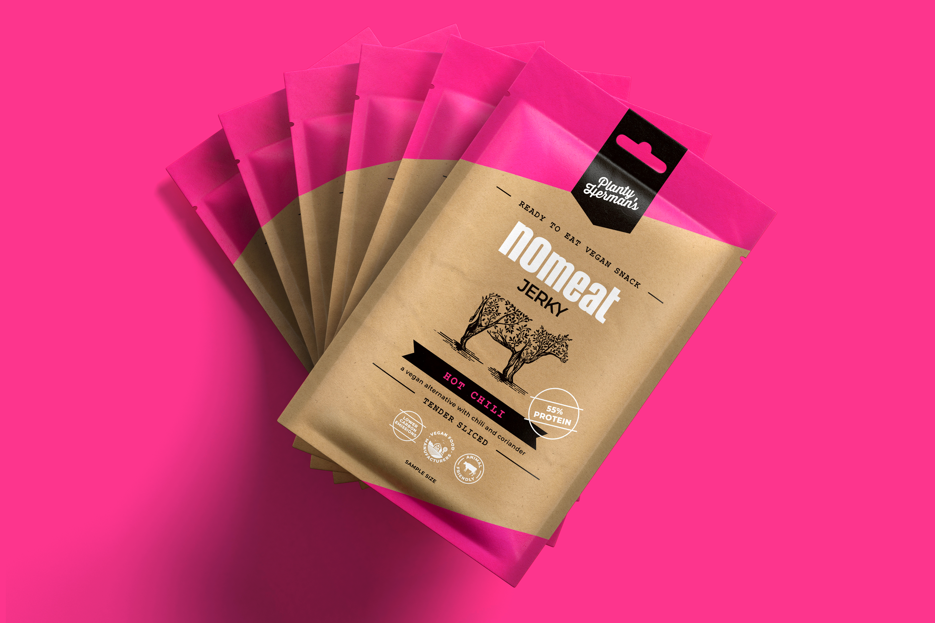
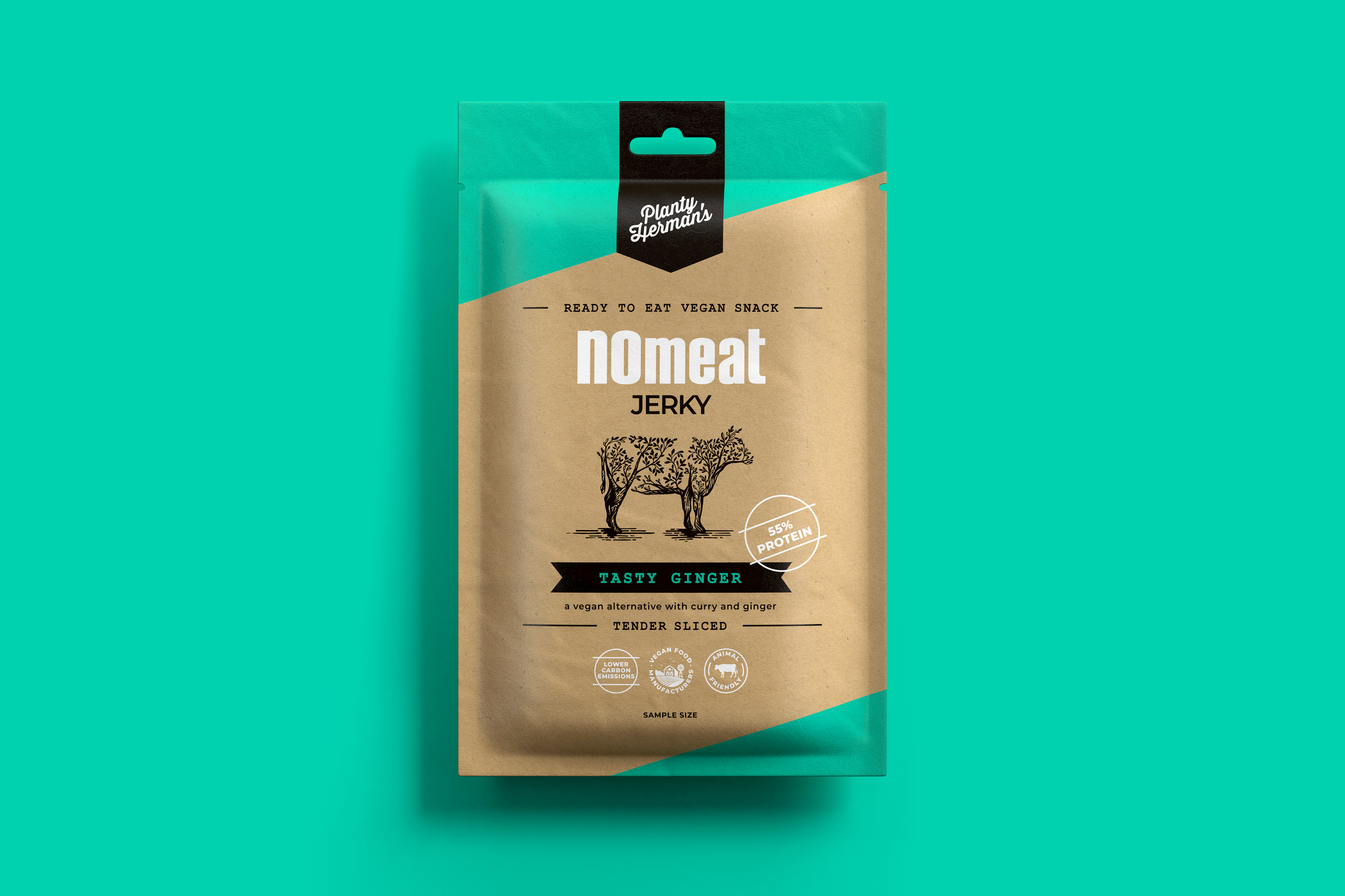
Some might say Planty Herman’s are mad scientists but personally I think they’re brilliant. Hailing from Germany, this innovative duo has concocted the most delicious vegan snack that is spreading throughout Africa and the States. Not only does it taste like meat, but it comprises 55% of plant-based proteins– the highest in the world. So this snack is the perfect vegan alternative to supplement your diet.
Rendering
@MF3D
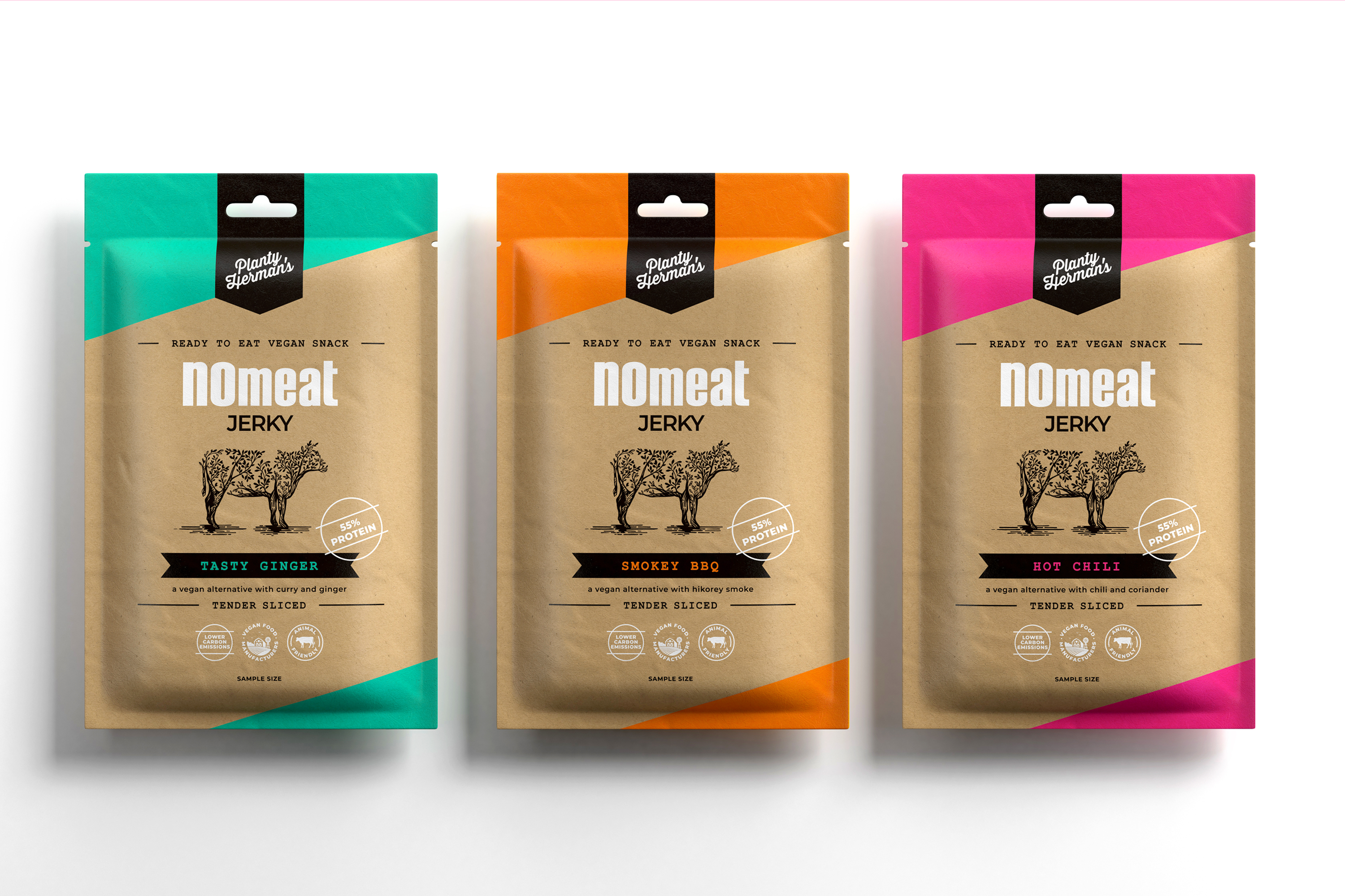
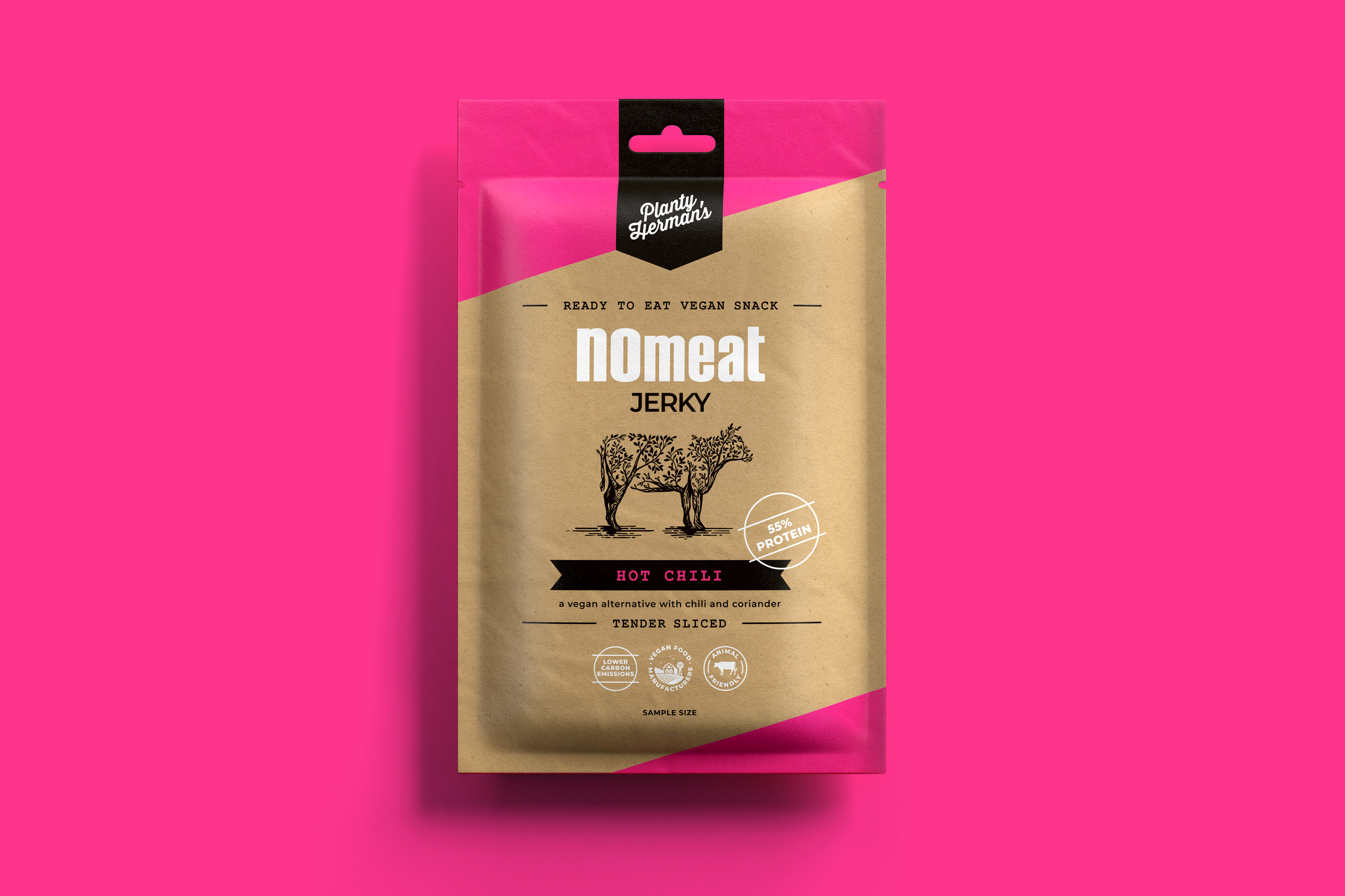
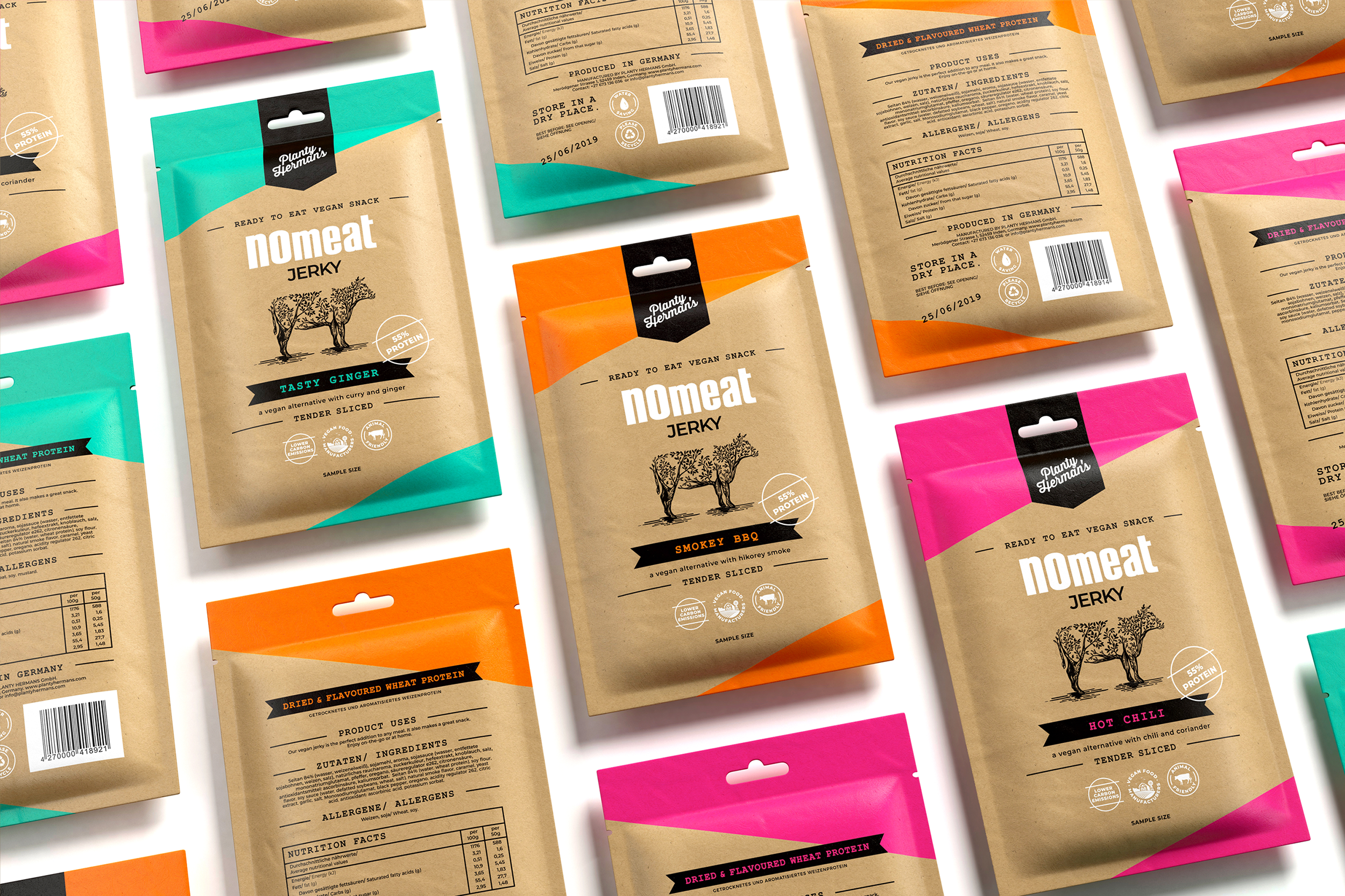
As a plant-based fan, I was delighted to be asked to redesign their packaging. The new look and feel needed to capture consumers’ attention while also immediately communicating that this is a healthy option.
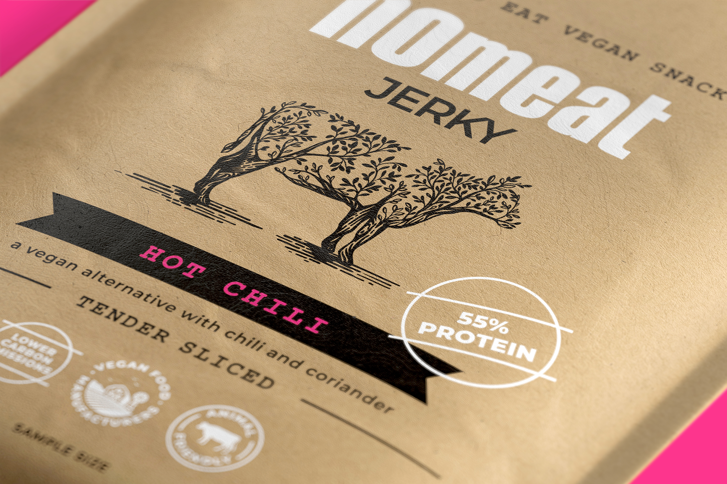
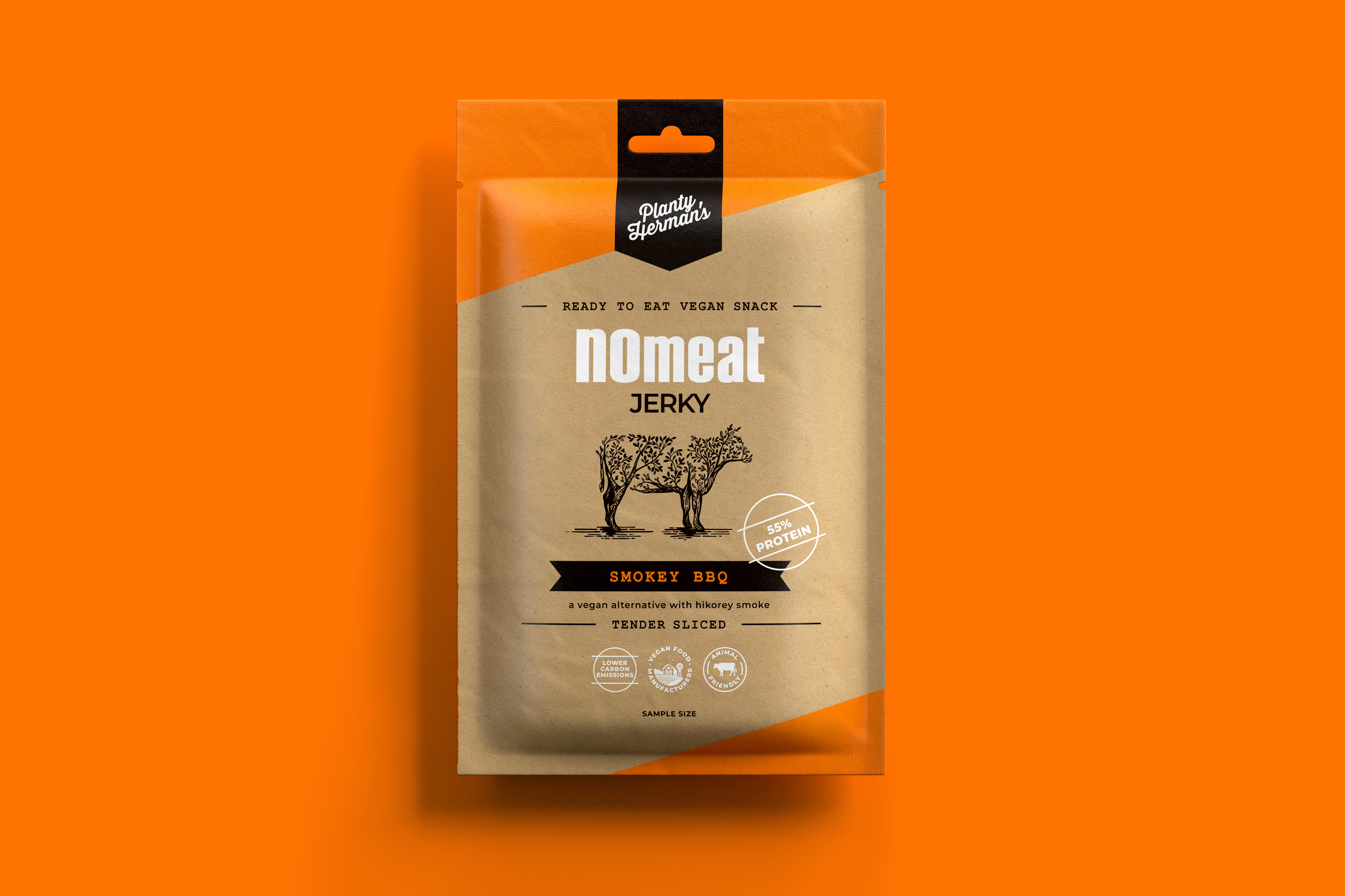
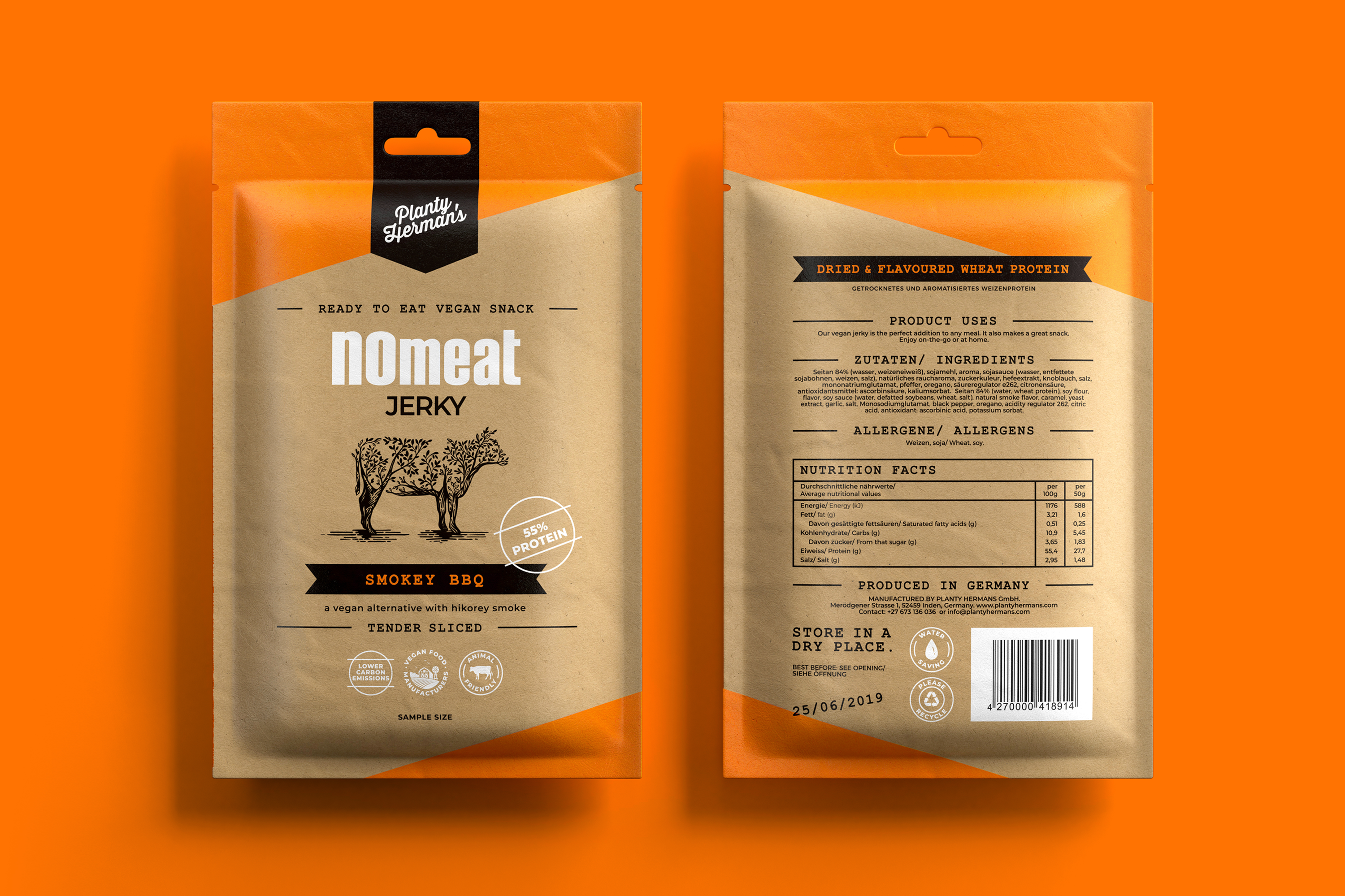
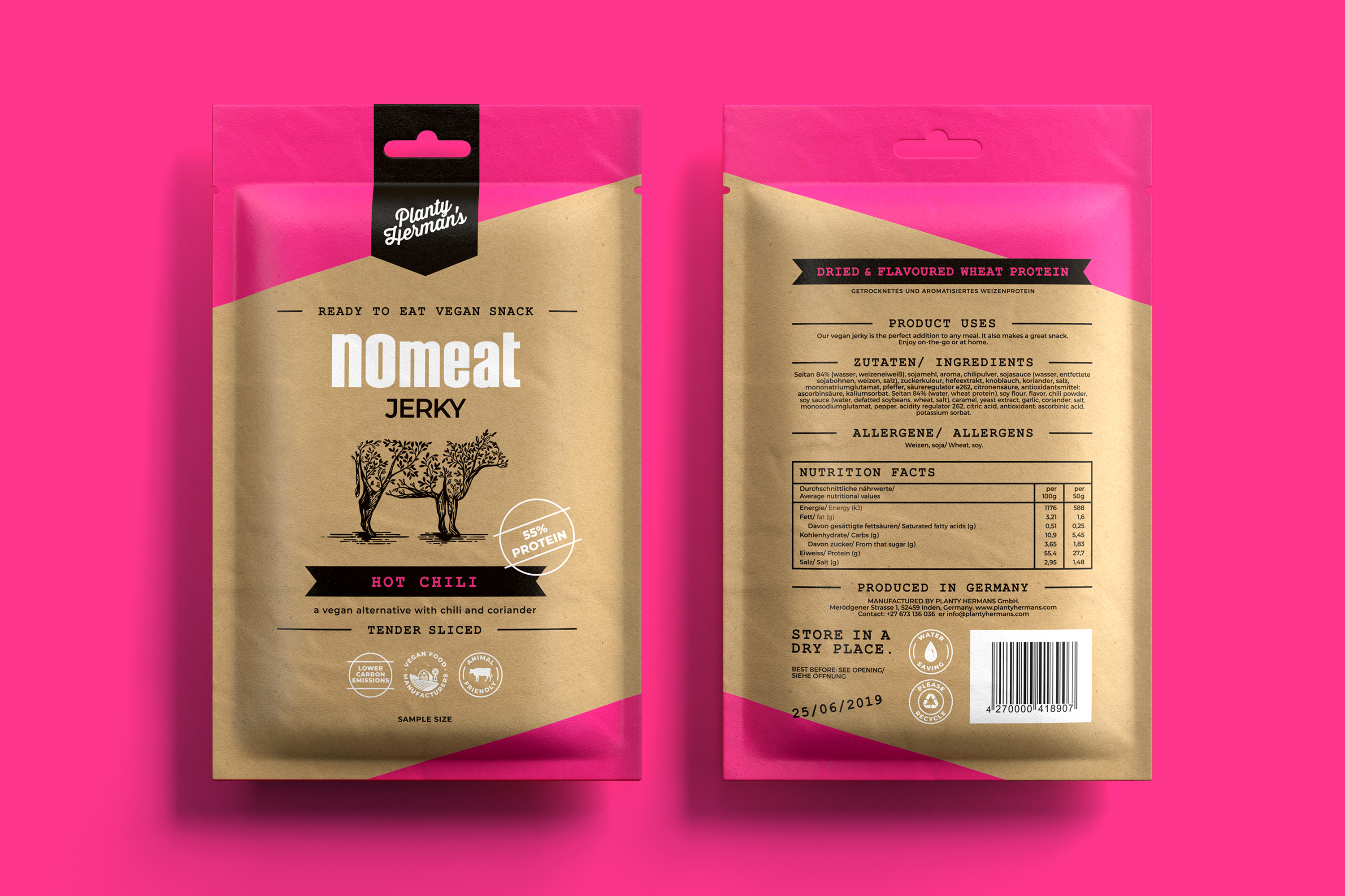
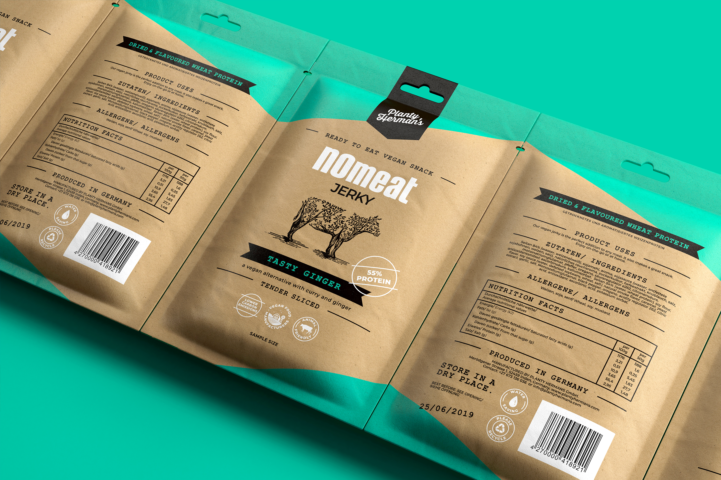
Central to this design is the cow illustration which is iconic of most old-school butchers. I decided to use this as inspiration, and then give it a ginger twist. The legs of the cow are the trunks of a tree and these then branch off into leaves which make up the body of the cow. So at first glance, it looks like a cow, but on closer inspection, the tree reveals itself. Housed within a dark ribbon band, much like the ribbon awarded to a prized bull, is the logo.
The typography design and placement are a throwback to meat and butchery designs from yesteryear.
The design is finished off with a bang of colour and stamps that highlight the values and health benefits that Planty Herman’s adheres to.
