_LOGO_IDENTITY
Coco
How I created a business card worth holding on to.
Coco is a consulting firm that serves as an intermediatory between farmers and clients in cocoa bean procurement.
Photography
@russsmwithphotography
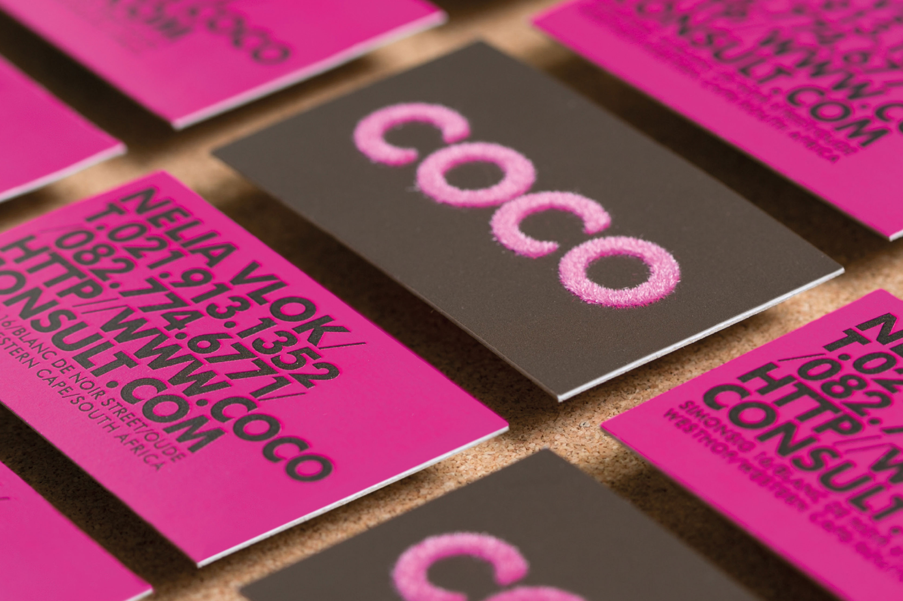
The owner and brand approached Ginger Storm for an identity and business card that was the polar opposite of what was currently dominating the industry. You know what I mean, the monotonous cocoa bean illustrations, icons, brown colour, and generic typography. In short they wanted a business card that would not be easily discarded.
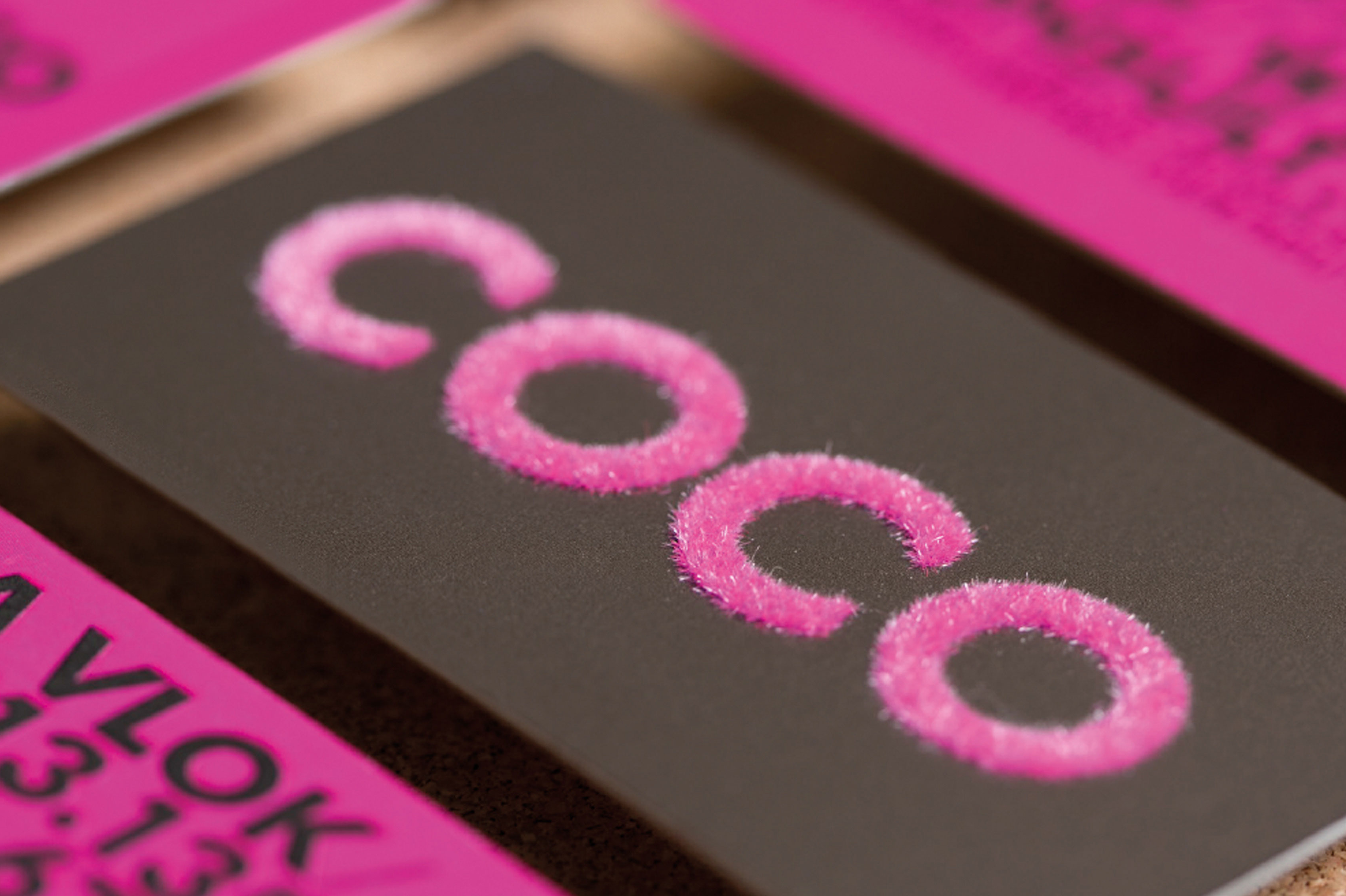
I created something that asks– “Who could possibly lose this simple yet visually tactile business card?”
The flocked pink logo adds texture, making the holder of the business card want to run their fingers back and forth. The bold back of the card copy is striking and complements the impact of the front of the card.
The end product is a memorable card that speaks to the visual and tactile senses.