1 July 2022
_packaging process
Despite the digital world, printed mock-ups are still a necessity
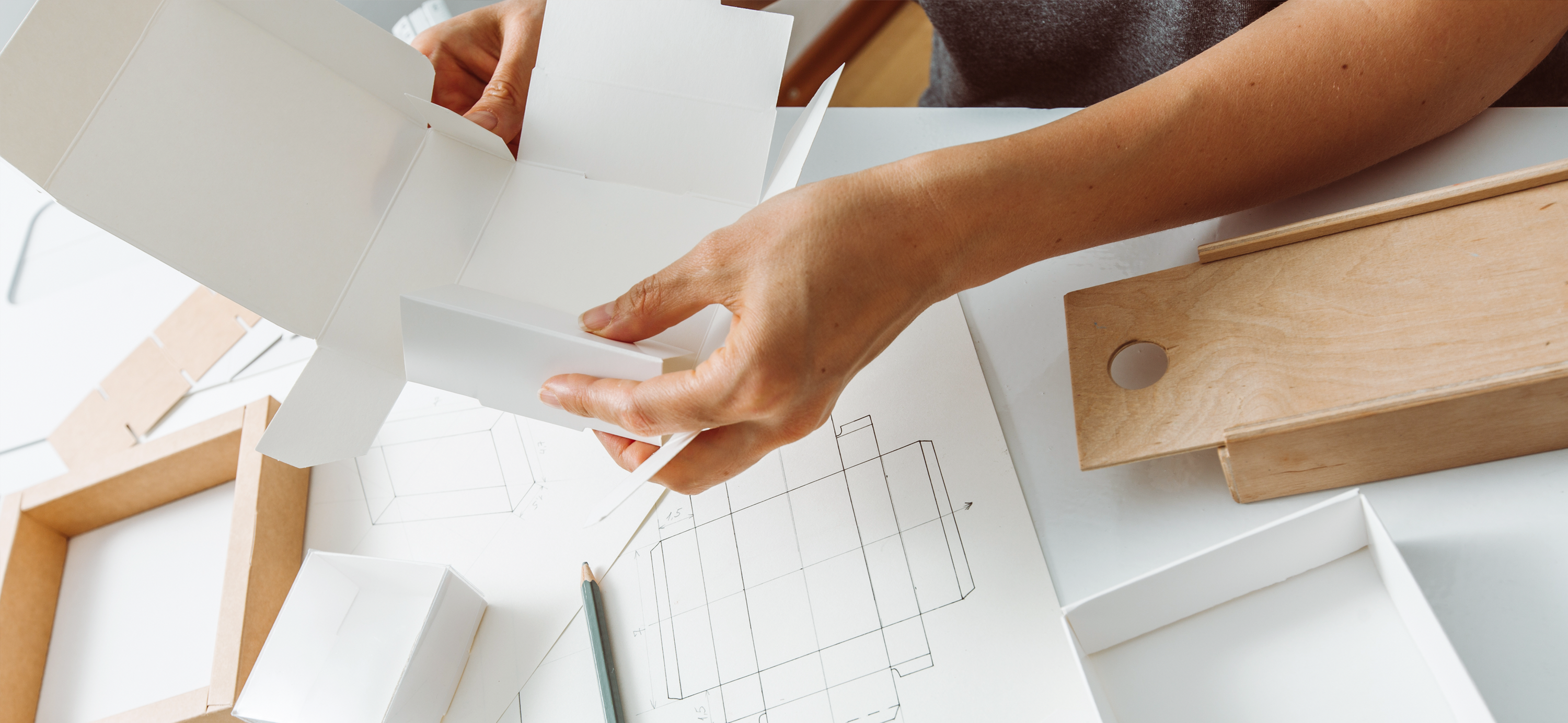
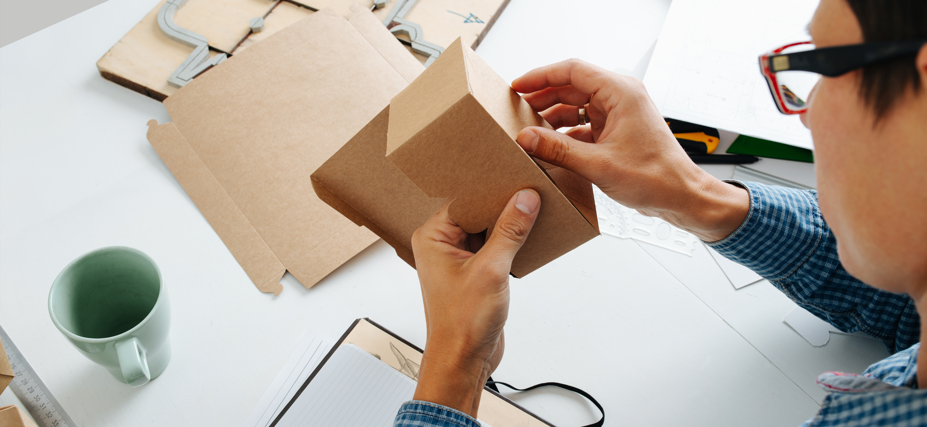
There is value in an old school printed mock-up. While it does take time and require a steady hand to assemble it gives you a fairly realistic idea of what your packaging design will look like in-store. It is also a skill that, in my opinion, many designers neglect to utilise. Graphic and packaging designers are overly reliant on the creative suite. You just need to look on supermarket shelves to see evidence of our mistakes. There is a way to fix this, but it requires stepping away from the computer.
By Candice De Beer
Ensuring uniformity across a packaging range
Type size is typically the problem child in packaging design. What looks correct on your computer can be flawed on retail shelves. It’s easy to make your typography too big or too small, and when creating designs for bottles or cylindrical packaging having your brand or product name obscured because it’s wrapped around the object is just disastrous.
So before you submit that perfect 3D rendering for your client to sign off, you need to create realistic print mock-ups. And this should be done in phase one of your design process, not at the end.
If I am designing a packaging range, I will usually work on four different type sizes and layouts. Never scale your design! While it will look fine in photoshop and illustrator, it won’t in-store.
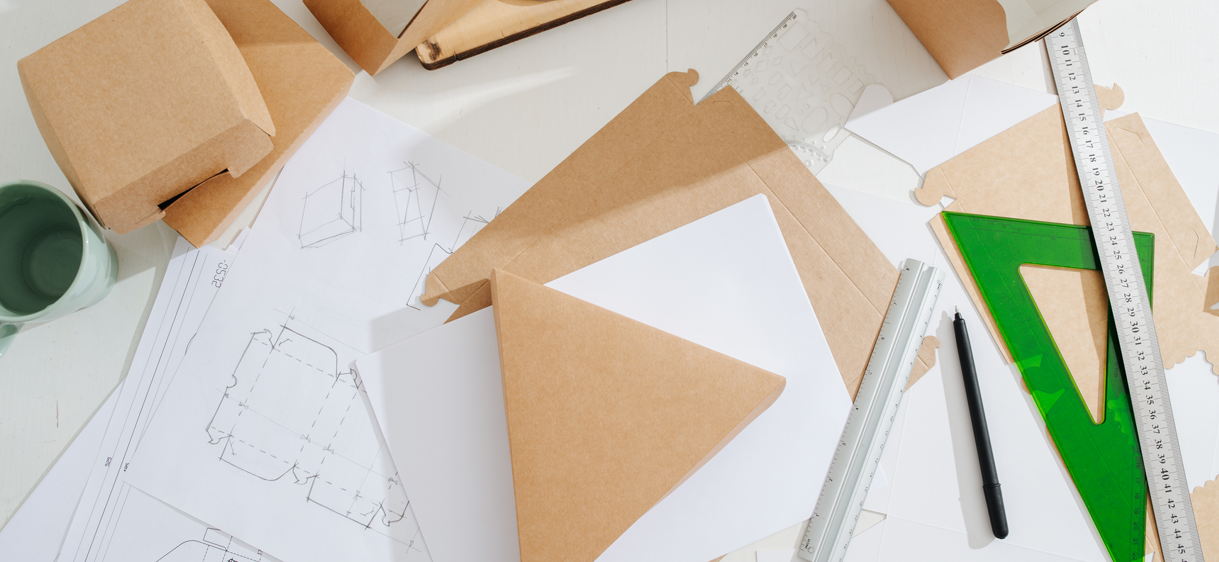
What you want to do is set up your die-lines, print your creative and mock it up. Now place it on a shelf, take a few steps back and look at your design packaging much like a consumer would. You’ll immediately notice where there are inconsistencies and oddities. You may need to tweak your copy placement or sizing, and it could take you several reprints to get it perfect. But that’s the point; it needs to be perfect.

Print and mock up en masse
What designers rarely take into account is the handling stage - this is when your printed artwork arrives at the factory for assembling. The women and men who do this do so at speed, and this will often reveal the tiny flaws in our design.
For example, while I’d assembled about 30 box designs for a packaging line I’d worked on, I’d done it slowly and meticulous with care. At the factory, thousands were expected to be assembled in a day and, unfortunately, at speed, the seal on the lid kept tearing because it was delicately small. To make it more robust, I had to go back to the drawing board and enlarge it. This meant a new print run and added expense.
My advice, print and mock up a couple dozen of your designs, and assemble the packaged creative fast and perhaps a little rough as this will give you a good indication as to whether it will fare well at the factory.
